Focus On Usability
After being heckled a bit on a Google Groups thread for providing a free service (Heckled for providing a free service?, you say. Believe me, I don't get it either) and being called a spammer, a poster challenged me to review his site, www.sellyourhouseforfree.com. I accepted his challenge.
Charles writes:
Can you review this site [link is above] for me please? ... Focus on usability.
Ok, so I reviewed your site, focusing on usability. Here's what I got:
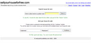
Overall, the usability is pretty good. Adding houses is easy, and searching is easy. A few things I noticed, though, are
- You've only got 500 some listings (at the time of this writing). While this isn't a programming/usability flaw, per se, it does render the "search by zipcode" box pretty useless, as there are thousands of zipcodes in the US, and it appears you're doing other countries as well. My suggestion would be a country dropdown, and if they pick US, dynamically display a state dropdown, and upon state selection, enter a zipcode. Also, allow the user to search at each level using those parameters (ie, all in US, all in Florida, etc). If you provide this COUPLED with the current zipcode box, it should increase your usability. Also, what is a place-name? As a user, I have no idea what this means.
- While it is very easy to create a user name and password, it may be too easy. If someone really wanted to mess up your database with fake usernames, it would not be very hard at all. Many sites require a bit of information before the user name can be registered, thus deterring attacks that you may be vulnerable to.
- In the search results grid (where, by the way, "countRy" is spelled "county" in your third column), the lack of the ability to sort by columns limits the usability. By ordering the properties by ascending prices, you assume that the only thing the user is searching for is properties by price, when in fact the user should be able to sort by all columns.
Other than that, the simple design lends itself to simple, straightforward, not confusing use. With some minor tweaks, this site could be very good, and has the potential to take off (provided you get more properties, some paid advertisers, and a bit of exposure). It reminds me a bit of a better looking Craig's List.


1 Comments:
LOL yellow on white, very usable :-)
Post a Comment
<< Home