The Passion of the Webmaster
 Colin writes:
 My website - http://www.wrwz.com is an information/content site about World Music and Culture. I write the content because I love it and do the design because I have to.First of all, congrats on writing about something you love. I build websites and help people for free because I love it, too. Passion is something often lacking from professionally built websites because the professionals don't understand your passion; they're in it to get paid and add another notch to their belts. On the other hand, professionals are professionals for a reason: they do good work, people like it, and they continue to get hired. Unfortunately, you can't build a website on passion alone, so you either have a fusion (a professional doing his own site) or a disparity. Very rarely will you get that fusion from a professional doing a paid job, and if you do, you should hold on to him or her.
Naturally, I am looking for tips and feedback for gaining more traffic.
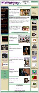
That said, let's get to your site. First off, your design, while clean, is unattractive and amateurish. If you are a real-deal magazine, no one is going to believe that this is your site. I don't know how "big-time" you guys are, but if you want an example of something to aspire to, check out Sports Illustrated's website. I'm assuming you don't have the kind of money they do, but understand my point: you can create your own credibility on the internet. If someone had never heard of SI and wandered onto their site, immediately they would recognize this site as a definitive source for sports on sheer design alone. Now if SI was indeed a fraud (which, of course, it's not), the user would quickly find out by the quality of the content. You have excellent content, from what I've read – interesting articles and even some instrument-playing "how-to's." If you complement that with a kickass design, you'll see your traffic level begin to rise. On a side note, if you're actually a print magazine, when you've finished your site redesign, make a big stink of it in your print. People will go, I promise.
Now to the more specific items:
- Your Google ads. They are glaring and obtrusive. There have been studies done that show that people are more likely to click on a Google ad if it is inconspicuous and appears to be just another link on your site (see my example at the top of this page *wink*). However, even if this wasn't the case, the ads look ridiculously out of place, since they don't even fit into the rest of your site's color scheme. Move them, change them, or get rid of them.
- Your pictures and graphics. They appear squished and grainy, and upon checking their properties, completely unoptimized. If you were to abide by my suggestions and actually get more traffic, your bandwidth would be out of control relatively quickly because your pictures are so large. For the sizes of the pictures on your site, none should be larger in file size than maybe 15-20KB max. If you don't have Photoshop, I would suggest making the investment. It's a bit much up front, but once you get the hang of it, you will realize it is worth it's weight in gold, salt, platinum, moon rock, and babies combined, especially if you want to remain in the internet world. As for your pictures being squished, if you're going to set the image height and width attributes, make sure they match those of the original size.
- Learn CSS and get a stylesheet. If my suggestion of you redesigning your site made your stomach do the watoosie, then learning CSS is your personal Pepto Bismol. You will find site creation and updates much easier if you have a stylesheet. For more on the power of CSS, check out CSS Zen Garden. Be sure to read everything on that site, as it is a great example of why you should use CSS.
- As with most sites I will review here, make sure your site validates. Right now your homepage lists 107 errors. If you want to see them, click the link in the column to the right that says "validate your code" and enter your URL. By ensuring your site validates, you are ensuring that your site is accessible to anyone using any browser on any platform as well as creating code that is easier to update should you have to.
- Your homepage is too long. This may be because of your inefficient use of space. Check out SI.com again and see how they don't waste a lot of space and yet somehow manage to keep the site from looking cluttered. They cover more material than you in less space. I understand you're a magazine and you have a lot to cover, but being a magazine, I would imagine you would understand the importance of page real estate.
That should get you started, Colin. You've got some good information on your site. If you read this article and couple it with yesterday's article, you should get a lot of help, since you guys are in a somewhat similar boat. I'd love to see what you can do with this, because it's got some great potential.


4 Comments:
Very nice site, Edelman. I really like your world music site also. Good luck to you. Gonzo
From an internet marketing standpoint you just need more content, more incoming links from others who enjoy the same as you and time. As your site grows and you hopefully avoid spamming you should do great. Think about how to introduce youself to others, visit their blogs and comment, make friends, get links.
What edelman said is correct but also remember that "novice" styled sites are for novices and other novices often feel at home visiting them. :)
I really like your world music site also.
Hire the most proficient custom essay writers who are passionately struggle to help young and inexperienced researchers with their truly onerous and boring assignments! Say "NO" to your endless sleepless nights!
Post a Comment
<< Home