Fix My Site

Does your site suck? Do you need professional advice? Do you not want to pay for this advice? Send me an email, and I'll take a look at your site and provide you with some real suggestions. By real, I mean real.

Wednesday, December 13, 2006

News, Lingerie, and Role Playing. Really.

Slashpix, anchor for www.news2.ca, reports,News 2

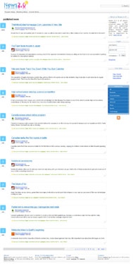
The idea behind this site is really simple; to create a community organized web application that would be powered by users. All users together act as administrators, which decide whatever to promote news or delete it. Therefore only interesting news would end up on main page. Users can promote news by simply voting for it. Users can also submit news that is related to already existed categories.
I just wonder if you can review this website.

Slash, there's one thing that Canadians are really good at aside from hockey and lumberjacking, and that's being on top of things. Like America, for instance (in a geographical sense, of course). You seem to be on top of things with this news site. While the concept isn't new (see digg.com), and the design is kinda plain, I still believe that this site has some potential. However, usually what separates sites with potential from one another is not a colander, as previously believed, but whether or not they do anything about their potential. Think about it as putting a brazier on your site. You need to raise your site up, and separate [yourself from the crowd]. One way to do this is to pick a really sexy bra, like one that will make people really want to see more (I am loving this metaphor). Maybe throw on a little lingerie over it with some velcr...okay, now I'm just fantasizing, and it's weirding me out. Don't worry, readers, I was definitely not imagining a website wearing lingerie, because that would be filthy and creepy and I'm going to stop this sentence now.

So, Slash, how can you improve your site? Well, several ways. First, as I so creepily suggested earlier, come up with an engaging design. You can even go so far as to completely scrap the design you have now and just sit down and think about a design completely independent from what Digg has (but for the love of White Castle, not in that order). The importance of this is far-reaching; normally I emphasize to submitores (soob-mih-TORE-ehs [don't pretend you don't know how to pronounce that last syllable, eh?]) to work on their content first and their design later, but since your content is pretty much user generated, it's time to work on that design. Right now I go to your site and I think, I'm hungry, and then I think, oh, a Digg knockoff (completely independent thoughts, sorry). I do like the site preview on mouseover, but you don't even have anything there indicating that this is even possible. Also, this feature breaks in Opera, where if the user mouses over the area where the preview is supposed to display, the picture shows up instead of only on mouseover of the link.

Oh, you also have some pretty horrific coding. You declare that the site is XHTML 1.0 Transitional, but you clearly do not follow any of the protocols required by this Doctype. This is surprising, especially for as simple as your layout is. It shouldn't take much to set up a very simple div layout with some CSS classes and have a unique, scalable, and beautiful design.

And while you're at restructuring your code, you might as well try to refigure your navigation, and maybe your overall functionality, which is a bit, how you say, wonky. Upon arriving at the site, the user is presented with three navigation buttons, an ambiguous search box, and a few news stories, with some peripheral information on the side.

Let's pretend now that we're role-playing (don't worry, no mention of lingerie to follow). First, I'm going to be the insecure high school freshman who wants to see the "Popular News" aka your first navigation button, so I click it while thinking about video games and senior girls. Hmm...nothing happens. Click. Click. Clickclickclick. Wait a second (voice crack), this links to the homepage! If this is "popular news", why does the first news story only have three votes, and the one under it have five? You mean to tell me that the most popular news stories you have have three and five votes? Clearly this is not the case, and is something you should look into.

Next, I will be an information-hungry CEO needing my news right this moment so I can make mission-critical decisions while I sip my $10 latte out of my gilded mug made out of rubies and mink fur. I click on "Breaking News", cellphones already out of both breast pockets of my custom-tailored, double-breasted suit (with power tie, mind you), eager to fire off calls to my #2 through #7 guys to get things going based on the news from...two days ago? Huh? Where's the news from one minute ago? Where's the news about my stock crashing/skyrocketing because of a goat in Iran having a kid that looks like Mother Theresa? I believe there may be something funky in your algorithm, because the news I see in the "Breaking News" section, while news, is hardly breaking.

Now, I will play the role of a website visitor. I want to see all news regarding the internet. Where do I go? Well, I can't figure it out by looking at the homepage, so I guess I'll scroll a little...oh, there it is! Halfway down the page, there's a big blue box with a bunch of categories. Hmm... My suggestion here, Slasher, is to get rid of everything you have on the right side (don't worry, we're putting something there, hold your ponies). You have a ton of space in your "main navigation" bar (you know, with the buttons that take you to the aptly named "popular" and "breaking" news pages), so why not put your login there? Or if not there, under your search box, where you also have a lot of fallow real estate. If you really wanted to be hip, you could make a little javascript-enhanced expanding/contracting box (kind of like Technorati or your role model, Digg). Since logging in isn't that crucial to your site, there's no reason to have it taking up valuable space. As for the "what is" section, I mean, I suppose you could keep it, but I would limit it to a teaser with a "read more" link, and then a button in your main nav to an "About" page. I would also get rid of the "justified" type setting. All the huge spaces between words to fill up lines looks about as awkward as a blind date with an actual blind girl (what do you say?? I don't know either! [Note: the past reference was referencing the irony of said situation, not that blind girls are undateable or deaf and mute in addition to being blind]).

I would then move your categories up to the top (or under your "what is" module) and below them, actually put in a sampling of what is in your so-called "tool box", ie, show a sample tag cloud, show the first few "top story" links, and show the first few "top users", all with links that say "See more" that take you to a page with the full results on it. This would be FAR more intriguing than just seeing a link that says that stuff is there. I want to taste it and swish it around my mouth a little before I take another bite, and maybe sometimes a nibble is all I want.

One last thing I'll mention before concluding this review is that you have this love of white space. While at times this can be good, in your case, you are misusing it. In the space you use to display one story, sites like Digg display three or four. Your page is so long because you s p r e a d e v e r y t h i n g o u t so much. Tighten up your whitespace a bit (if you plan on keeping your current design) and you'll notice huge improvements in usability and in people actually getting to story number ten. Oh, and, uh, your logo? Yeah, the reflection should look a little bit more like a reflection. Right now it looks like you have "News 2.0" standing on top of the Russian version, which happens to be in version number "backwards-7.0".

Overall, like I mentioned earlier, any site utilizing this idea has the ability to take off. But, with a market this saturated (Digg, del.icio.us, Magnolia, Spurl, Furl, Girl, Jurl, Purl, etc etc) you have to come up with something truly unique to set yourself apart from the crowd, or you'll never make it into the congeries of little bookmarking icons that adorn the ends of most bloggers' posts. Can you do it? Well, that's up to you. Let's see if the Canadian in you helps you come out on top.

Wednesday, December 06, 2006

Blogger Sentenced to Life in Cleveland

Okay, so enough self-horn tooting. Let's get back to my bread and butter, which is the mordacious destruction of fellow webmasters' pride, dreams, and love of life in an attempt to help them better their sites and themselves. The fangs have been re-cut. Onward, ho!

Hot Coffee Girl, brewer of, surprise surprise, hotcoffeegirl.squarespace.com, writes: Hot Coffee Girl

I like your site! I am also a web designer/developer...and I am going to crawl back through your archives to check it all out. There is always a lot of information out there, and your site is a good resource for people to go. I imagine I will end up blogrolling you...I keep my roll at 15 or less, but I just kicked someone off so I have been looking for an addition.
Feel free to review my site.

And feel free I will, as is my right guaranteed to me by the laws governing the land I pay tens of...millions of dollars in taxes to each day to protect my well-being, wealthify the unambitious, change my streetlamp lightbulbs, and buy really, really expensive toilet seats. Oh, and give me rights and stuff. And if you look up wealthify, it's like, number three on the list of words to be added to Webster's, right under "to ride dirty" and right before "joladb", which is a mystical Innuit creature who was able to ferment snow into Eskimo beer, otherwise known as "Eskibeer". According to legend, it was the first beer ever discovered, ironically explaining the correlation between Molson's and urine. Hmm...

Oh, damn, I forgot. I'm doing a site review. Well, HCG, I must say that I pity you, but I respect you. Putting up with life in Cleveland, Ohio is by far one of the most cruel punishments that a judge could have given you for that time you took a shovel to that litter of puppies and baby giraffes gamboling with the butterflies and rainbows in the buttercup field. Man, when I read about that, I nearly cried. But living in Cleveland, while cruel, serves you right. I've always wondered if when the children who are forced to grow up there draw pictures of their families, do they include a sun? I was just curious because I doubt they even know what the word "sun" means, unless it's in the form of, "Son, go git me a berrr." But, as always, I digress.

I think part of the reason I enjoy your blog so much is not the simple, straight-forward design, since design is like very thin icing on a huge, delicious ice cream cake, but because your writing is stellar. You tell a good story and you can spell — two very important things when considering whether or not I read someone's blog. Occasionally I will even chortle whilst reading posts about you getting stuck in the snow and freaking out, or on how much you hate something or someone, or about making sexy time with a Boy (or with yourself?). I think what's really impressed me the most, though, about this blog, all BS aside, is how complete it is in terms of features. You have everything from good writing to galleries full of self-proclaimed bad paintings (why you have a gallery of them, I don't know, possibly for comedic value, but it's a gallery nonetheless) to video interviews of you, and we're not talking YouTube amateur porn. I mean, the guy had a microphone, and not the kind where he introduces himself by saying, "Hey, baby, you wanna, uh, talk to my microphone?" but the real kind that transmits sound. Granted, I don't know how much is actually cookie-cutter squarespace templating and how much is HCG Inc., but regardless, it offers a lot of entertainment to the would-be reader. Also, the theming of the design? Loves it. The big thing going around the internet (or so I've heard) is that "Fix My Site Month" is quickly overtaking "Christmas" as the popular theme for December (strangely, in offline arenas as well, like I totally saw this car dealership decked out in grey and orange with pictures of my snooty man pasted on all the windshields. It was classy). I suggest you follow suit (I did).

As for what you could do to seriously improve your site, I mean, sure, you can always improve a design and you can always clean up sidebars, but I think that for blogging, design should always come second to content. It doesn't matter if your blog looks like the sum of an elephant and three gallons of Super Colon Blow (figuratively, of course. I wouldn't want to stare at that while trying to read) as long as your content is engaging in some way, be it through interest, humor, or utter disgust and depravation. Sure, you may turn some readers away by a page covered in pachydermal fecal matter, but you don't want them anyways, the closed-minded maggot pies. But, of course, your page is not feces-smeared, so you have far less to worry about.

My advice? Keep on writin. Nobody likes a blogger who stops writing for a month-and-a-half at a time. Oh.

Okay, back to self-tooting. For you cryers and haters out there moaning, "Oh, all he does is tout his own stuff," I suggest that you recall whose site this is, and then take some of the aforementioned Super Colon Blow and go drive on an Alabama highway at night. Anyways, I've just "finished" (and by "finished", I mean "pushed live") my personal site, www.jasonedelman.com which at the moment contains pretty much nothing but an imported version of this blog and a little bit about myself, but will eventually include a portfolio of work I've done and a handy-dandy little section where I aggregate all the articles I've bookmarked that have been influential in my development as a, um, developer. So check it out, bookmark it, cry and paw at the screen while you look at it because it is so beautiful, do whatever, and go ahead and send me a message through my little contact form. I'm thinking of also putting my review queue up there somewhere so you know exactly where you stand in line and that I'm not full of crap when I tell you that there are 132895127 people in front of you. It could happen.

Tuesday, November 28, 2006

Finally, He Has Contacted Me: Fix Me!

Well holy crap. I'm still alive, yep. I apologize to all my loyal readers who have been afraid to turn their comps off at night for fear that the window they've kept open for the past month and a half will magically update with a new review from me. It won't happen again. You see, I've been a bit, how you say, busy lately...........

Jason, brainchild behind www.littleworksusa.com, writes: Little Works USA

I've just finished working on a client's site, and was wondering what you thought. I cower in your all-knowing, all-seeing presence, O Handsome King of the Interwebs. Be gentle. I love you.

Jason, that's so sweet of you. You know, after looking at your site, I couldn't help but think, "Wow, this is the best all-around site I have ever seen on the internet. And damn, you must be good-looking and witty and smell of delicious." For real. I mean, let's talk flawless design, beautiful coding, fantastic programming, and overall wonderful structure. Ladies, gents, if you want to learn how to build a site, you should go take a look at what this guy has done, and maybe listen to what he says, because boy, oh boy, is he good. I love you, too.

Okay, so for those of you who are still catching up, well, man that Jason is awesome. The Awesome, in fact. For those of you on board, I salute you. I decided I would do something a bit different this time since I hadn't done anything in a while, and, I mean, the site is called "Fix My Site", so I proffer my latest work to you, John and Jane Q. Publix. Here's your chance to get back at every curse, anathema, malediction, and execration (all wonderful synonyms for the formerest) ever hurled at you through your CAT5 (or phone cord, Gramps) via my pudgy fingers.

But before you get started, I will include a mitigating list of known issues that I already know of and cannot do anything about:

  1. The HTML does not validate on pages that have an image button. This is because VS.NET 2003 inserts an invalid attribute into this control that renders the page, well, invalid.
  2. IE7 - The "featured product" content does not display. The background image on the subnav once the user is within the site displays sporadically.
  3. MacIE - This browser sucks and maybe 10 people in the world use it, so I did not code for it. Sorry.
  4. There's no secondary navigation at the bottom. I felt this was unnecessary and would throw off my pretty design, anyways.
  5. I know there is no "home" navigation element. However, as is standard best practice, the logo in the upper left corner is a link to the homepage, so get over it.
  6. Since I've added the CMS to the site, the client has made some modifications, so some things, such as pictures or colors, that look a smidge out of whack with the rest of the design are probably not from me. I'm just sayin.

Other than that, let me have it! Also, please patronize this site, as a portion of the proceeds go to charity. I hope you like my work! And, uh, if you're looking to have any work done, well, you know how to reach me *wink* *tongue click* *tongue click* *finger guns*. Don't be afraid to contact the owner of this site to ask her about me, either, she's been trained very well on what to say.

Monday, October 16, 2006

How To Land A Girl, Part I: Claim Her

I haven't really cracked into reviewing the blogging world, since, as you may or may not be able to tell by this garbage blog, I'm not an expert blogger, but I got this email and I couldn't resist. She sounds too pretty. I'm a sucker for pretty.

Brittany, vixen of pshaboutthat.blogspot.com, requests,

About That

Mr. Edelman,

I know nothing about all this crap, but I love the way you write...mmm...it’s the hot. You are my only link on my page, so I figured why not. You know the drill; in case you forgot, follow my simple instructions below.

Review my site. Bitch.

Well well well...aren't we fiesty? Just how I like 'em. Hopefully you're not a 52-year-old woman pretending to be 22, because that would be, as you would say, the sad. And the creepy. I'll just pretend that you're a hot 22 year-old girl with a thing for guys who have nothing better to do than try to help hapless webmasters on his lame Blogger blog. I'm glad you like the way I write. Some people just come and see that it's a Blogger site and completely discredit it for no other reason than that. It's refreshing to hear that someone's actually reading this. I'm your only link, eh? I guess that means we're dating.

So, Girlfriend, let's talk about your site. Holy crap. Yeah, I said it. Have you seen your design? I mean, for the love of Texas Pete and various other hot sauces, it looks like you just took a default template from a free service and didn't do a thing to it. There's no way anyone will ever read anything on your site because the design is so cliché and bland and unoriginal and...oh, wait. I have one of those, too. Hmmm...isn't it great to be able to focus completely on content (of which yours is a-mazing, but more on that in a moment) without having to worry about design?

I'm sure guys hit on you constantly, so this analogy should hit home: So Guy1 takes you out to dinner and he's just the handsomest thing ever. However, the conversation consists of him staring at your chest and commenting on the deliciousness of the beer in his hand. Kinda sucks, huh? Now you can't ever wear that dress again because the popped seams from where he ripped it open with his eyes will remind you of that horrific date. This is kind of how your site is. People are just looking for flashy design to validate whether or not your content is worthwhile, but sometimes can't look past it, or don't even care. What they don't realize is any moron with enough cash to burn can drop $100 in the saliva pool collecting at the feet of blog designers, upload the design, and continue writing crap content. Who wants to read a blog that's 99% looks and 1% content? Is that even considered "reading" or just eye-raping?

So I applaud you on biting your thumb at the blogging community and not spending time or money on a design when a) you aren't going to be making any money off of this site, and b) you clearly don't care if people even like what you write. Your (hilarious) writing alone is enough to keep people coming back. You've already got more comments (and secret admirers) than me and your blog is a month old. I pretty much have to beg for comments, and I still don't get them (anyone? anyone?). While your posts are spread out, it almost adds to the quality of the blog. Sure, frequent posting is a good thing, and is the one thing I would suggest you do with this blog, but when you post more sporadically (and are consistant with your sporadicity) without too much time betwixt posts, people will keep coming back. Hell, I depend on my reader(s) checking back every once in a while, because I sure can't post every day. Sometimes it'll take a week or more for me to write a review. This one? Three months in the making, baby.

Oh, yeah, I did just call you baby. But I guess I can do that now that we're dating.

Wednesday, October 11, 2006

I Mean, I Guess It's Fine

Karen Shanley, possible author of www.karenshanley.com (I'm guessing here), declares,

Karen Shanley
I'm an author, not a site designer, as you'll see. What's there is what I could figure out how to do on my own....I'm open to any other suggestions you'd like to offer. Feel free to post to your site.

I would say it is safe to, well, say that you are indeed an author and not a site designer. That being said, I think your site serves your purpose well. You are a writer like me (eh, well, in the respect that we both write. You have, like, a book, media appearances, and money and stuff. I have, like, a blog and a degree that says I should know how to write), and while artistic with words, the whole drawin paintin buildin thing isn't our bag (we'll pretend I don't design sites, either). If your site was super flashy with all sorts of crazy rollovers and amazing web 2.0 graphic themes, I think it would take away from the book, which from the excerpt I read, is more earthy and real-lifey (and of course, well-written), kind of like what keeps people like me who spend their whole lives looking at glowing boxes out. Clearly, I'm not your audience, and neither are most people who would be looking for something flashier, so in that respect, this site is well done.

The design is appropriately simple and very clean. No crazy CSS tricks to be found in this site, kids. However, this doesn't mean you can't code it correctly in case you wish to do a reskin later. If you take a look at your code, you will find oodles of inline styling (inline styling meaning instead of using CSS, you're using attributes in your HTML tags and font tags, like <font size="3" face="Times New Roman, Times, serif">) and zero line breaks, making code editing harder than nailing jello to a tree (but easier than, say, eating jello that's been nailed to a tree, because let's face it, that ain't jello). My guess is that you have no idea what I'm talking about and wish I would stop, since I'm pretty sure you didn't hand-code your site. But regardless, as it is my duty, I must inform you that your code sucks more than the Wolverines (Go Bucks!). The reason I'd give you for making your code more editable is in case you decide to do another book, you could have a site ready for you without much coding. But again, moronically, I proceed knowing full well that you did not have a hand in coding your site. Ugh. Moving on...

Your writing and content, of course, is mediocre. If you really want to learn how to write, I suggest you read my site a few more times, since I'm clearly the only one on the interwebs who knows how to string a cogent sentence together. For reals, though, I like your writing. I, too, would like to maybe write something someday (as a few people have occasionally suggested I should (a few people being, like, one anonymous commenter)), but once more I get sidetracked, as this review is not about my hopes and dreams, but rather squashing yours, of which I have not been doing a good job.

If you haven't left the review by this point, it's probably just because you're curious to see how long I can BS my way through the review of a site that doesn't have a whole lot to it. Let's talk about your blog!

Earlier you came to me asking me for help with some coding issue you were having with your blog and I helped you. You wrote about me, and I blushed. My mother doesn't even say stuff that nice about me. Since then I've been a celeblogity (blogebrity? celebritogger?) and I have hordes of eager girls knocking on my door with markers trying to get me to sign various body parts and baby's foreheads. Honestly, the paperazzi, not that bad. A lot of facial hair, but let's be real, these guys live in bushes for most of their adult lives, waiting to pop out to catch that split second when their target is in some uncompromising position picking up their morning paper. So rather than fight it, I'll feel sorry for them and pose for a picture with my fingers, which is from where the power of my blogging ability stems. You should be able to catch my interview in such fantastic publications such as The New York Times, Highlights for Children, and Sports Illustrated. I picked those because that's how I roll.

Karen, I don't know what you'll get out of this post much more than, "I mean, I guess it's fine," and, "Really, Jason, don't you have anything better to do with your time?" Your site serves your purpose, and all the help I would give to an aspiring webmaster would be lost on you, anyways. So to add a smidge of value to this post, I present to you, a fish:

<'))))><

If you don't ever come back to read my reviews, I totally understand.