News, Lingerie, and Role Playing. Really.
Slashpix, anchor for www.news2.ca, reports,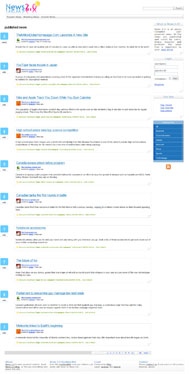
The idea behind this site is really simple; to create a community organized web application that would be powered by users. All users together act as administrators, which decide whatever to promote news or delete it. Therefore only interesting news would end up on main page. Users can promote news by simply voting for it. Users can also submit news that is related to already existed categories.
I just wonder if you can review this website.
Slash, there's one thing that Canadians are really good at aside from hockey and lumberjacking, and that's being on top of things. Like America, for instance (in a geographical sense, of course). You seem to be on top of things with this news site. While the concept isn't new (see digg.com), and the design is kinda plain, I still believe that this site has some potential. However, usually what separates sites with potential from one another is not a colander, as previously believed, but whether or not they do anything about their potential. Think about it as putting a brazier on your site. You need to raise your site up, and separate [yourself from the crowd]. One way to do this is to pick a really sexy bra, like one that will make people really want to see more (I am loving this metaphor). Maybe throw on a little lingerie over it with some velcr...okay, now I'm just fantasizing, and it's weirding me out. Don't worry, readers, I was definitely not imagining a website wearing lingerie, because that would be filthy and creepy and I'm going to stop this sentence now.
So, Slash, how can you improve your site? Well, several ways. First, as I so creepily suggested earlier, come up with an engaging design. You can even go so far as to completely scrap the design you have now and just sit down and think about a design completely independent from what Digg has (but for the love of White Castle, not in that order). The importance of this is far-reaching; normally I emphasize to submitores (soob-mih-TORE-ehs [don't pretend you don't know how to pronounce that last syllable, eh?]) to work on their content first and their design later, but since your content is pretty much user generated, it's time to work on that design. Right now I go to your site and I think, I'm hungry, and then I think, oh, a Digg knockoff (completely independent thoughts, sorry). I do like the site preview on mouseover, but you don't even have anything there indicating that this is even possible. Also, this feature breaks in Opera, where if the user mouses over the area where the preview is supposed to display, the picture shows up instead of only on mouseover of the link.
Oh, you also have some pretty horrific coding. You declare that the site is XHTML 1.0 Transitional, but you clearly do not follow any of the protocols required by this Doctype. This is surprising, especially for as simple as your layout is. It shouldn't take much to set up a very simple div layout with some CSS classes and have a unique, scalable, and beautiful design.
And while you're at restructuring your code, you might as well try to refigure your navigation, and maybe your overall functionality, which is a bit, how you say, wonky. Upon arriving at the site, the user is presented with three navigation buttons, an ambiguous search box, and a few news stories, with some peripheral information on the side.
Let's pretend now that we're role-playing (don't worry, no mention of lingerie to follow). First, I'm going to be the insecure high school freshman who wants to see the "Popular News" aka your first navigation button, so I click it while thinking about video games and senior girls. Hmm...nothing happens. Click. Click. Clickclickclick. Wait a second (voice crack), this links to the homepage! If this is "popular news", why does the first news story only have three votes, and the one under it have five? You mean to tell me that the most popular news stories you have have three and five votes? Clearly this is not the case, and is something you should look into.
Next, I will be an information-hungry CEO needing my news right this moment so I can make mission-critical decisions while I sip my $10 latte out of my gilded mug made out of rubies and mink fur. I click on "Breaking News", cellphones already out of both breast pockets of my custom-tailored, double-breasted suit (with power tie, mind you), eager to fire off calls to my #2 through #7 guys to get things going based on the news from...two days ago? Huh? Where's the news from one minute ago? Where's the news about my stock crashing/skyrocketing because of a goat in Iran having a kid that looks like Mother Theresa? I believe there may be something funky in your algorithm, because the news I see in the "Breaking News" section, while news, is hardly breaking.
Now, I will play the role of a website visitor. I want to see all news regarding the internet. Where do I go? Well, I can't figure it out by looking at the homepage, so I guess I'll scroll a little...oh, there it is! Halfway down the page, there's a big blue box with a bunch of categories. Hmm... My suggestion here, Slasher, is to get rid of everything you have on the right side (don't worry, we're putting something there, hold your ponies). You have a ton of space in your "main navigation" bar (you know, with the buttons that take you to the aptly named "popular" and "breaking" news pages), so why not put your login there? Or if not there, under your search box, where you also have a lot of fallow real estate. If you really wanted to be hip, you could make a little javascript-enhanced expanding/contracting box (kind of like Technorati or your role model, Digg). Since logging in isn't that crucial to your site, there's no reason to have it taking up valuable space. As for the "what is" section, I mean, I suppose you could keep it, but I would limit it to a teaser with a "read more" link, and then a button in your main nav to an "About" page. I would also get rid of the "justified" type setting. All the huge spaces between words to fill up lines looks about as awkward as a blind date with an actual blind girl (what do you say?? I don't know either! [Note: the past reference was referencing the irony of said situation, not that blind girls are undateable or deaf and mute in addition to being blind]).
I would then move your categories up to the top (or under your "what is" module) and below them, actually put in a sampling of what is in your so-called "tool box", ie, show a sample tag cloud, show the first few "top story" links, and show the first few "top users", all with links that say "See more" that take you to a page with the full results on it. This would be FAR more intriguing than just seeing a link that says that stuff is there. I want to taste it and swish it around my mouth a little before I take another bite, and maybe sometimes a nibble is all I want.
One last thing I'll mention before concluding this review is that you have this love of white space. While at times this can be good, in your case, you are misusing it. In the space you use to display one story, sites like Digg display three or four. Your page is so long because you s p r e a d e v e r y t h i n g o u t so much. Tighten up your whitespace a bit (if you plan on keeping your current design) and you'll notice huge improvements in usability and in people actually getting to story number ten. Oh, and, uh, your logo? Yeah, the reflection should look a little bit more like a reflection. Right now it looks like you have "News 2.0" standing on top of the Russian version, which happens to be in version number "backwards-7.0".
Overall, like I mentioned earlier, any site utilizing this idea has the ability to take off. But, with a market this saturated (Digg, del.icio.us, Magnolia, Spurl, Furl, Girl, Jurl, Purl, etc etc) you have to come up with something truly unique to set yourself apart from the crowd, or you'll never make it into the congeries of little bookmarking icons that adorn the ends of most bloggers' posts. Can you do it? Well, that's up to you. Let's see if the Canadian in you helps you come out on top.


11 Comments:
Design of a site is pretty important, I agree with you, but is it the only thing that users value? Is it the only thing that will help you, as a webmaster in promotion and maintaining visitors everyday as well as earning money.
For example, there are a lot of sites that don't have perfect design. Google for example, simple and white but still it is really popular. Plantyoffish.com doesn't have a pretty good design also but the owner earns 300 000 per month.
So my question is, what is more important design or the way you promote it?
Just from a design standpoint since Edelman here pretty much covered the coding and functional aspect like white on rice... mmm... rice. The minimalistic approach is good and it works, however in minimalism, any small tiny mistake you make will look 10 times as bad. You might think I'm nitpicking but certain small details popped up to me the first second I saw the site. The small triangle or upturned box you use at the lower right corner of every rectangle isn't an equilateral triangle or even an isosceles one. The left vertical side is actually 3 pixels longer than the top horizontal edge, yes I measured it in photoshop but it's apparent even to the naked eye. Also the shadow you use for the triangle gets cut off at the bottom corner on the left, which is odd looking. And finally, the diagonal side of the triangle is two pixels thick while every other line is one pixel thick. The only way to make single pixel diagonal lines is to make sure the diagonal is at a precise 45 degrees, no more and no less. I redid a version of the upturned corner along with a faint shadow for the box because your site is waaaaay too naked, so any small subtle details would help and make it look well put together instead of unfinished.
Hey the anonymous guy in the first post. I don't think that's a fair comparison. Google actually does have good design (every holiday has their own google icon!), the most important part about it is that it doesn't hammer the server and everything loads/searches fast because it's accessed by millions of people each day. Just because it's "simple looking" doesn't mean it's bad design, in fact the simplest solution to a problem is often the best design by far.
Btw, users do not care about promotions, because once they're a user, they already know about the site and are already there. Maintaining visitors is mostly about content and design is a HUGE part of that. Promotion is all about getting new users to try the product. However, on the flip side, promotion can be important, brute force marketing is what kept AOL afloat despite it having god awful service. Also why the hell were spy/malwares so popular? The products itself were obviously crap and malicious, it was all about the marketing and promotion. However in my opinion, it's build a good design first, then promote it, good products promote themselves.
Even after all this, Digg appears to be doomed for Disaster....
haathi
Hi,
I noticed that you commented on a problogger post about blog comments. I wanted to drop you a note and tell you about ClickComments. It engages the 95% of your readers that never comment. With one click they can comment. Easier commenting means you will get more commenters. Try it out.
http://www.postreach.com/static/clickcomments
Regards,
The PostReach team
Hmmm, seems cool.
Joe joestain13@yahoo.com
Hey, I need your help. I had a web designer create my website: www.Lesliegotogirl.com and I have the ftp files and everything. What should i do now if I want to update it, remove something, add a promotion, etc..Would you recommend I get a book and learn how to do it myslef or just send it along to another web designer?
Leslie -
Depends on a few things. You know how to FTP, so it's possible that you know about HTML. If you do and your site has no backend programming (ASP.NET, PHP, etc.) go ahead and make the changes and upload. If not, get a book or learn about HTML online (from any of the 293028602 tutorials out there. That is a real number. There are exactly that many). If you don't want to deal with it, find some poor developer somewhere and pay him or her money to work on it so that they may buy the beef-flavored ramen noodles for dinner one night. Good luck!
Great post. Very informative for new learners.
Having good tips and tricks. You Have done awesome work! keep it up. I need to know more from your blog.
Thank you for posting this blog. it really help me alot.. very informative blog I should say.. thanks for your tips! God bless!
This comment has been removed by the author.
Post a Comment
<< Home