Where Count Cookie the Grouch Goes Tanning
Jeffrey, the solar power behind www.solsuntherapy.com, quoth: 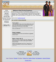
"Fis my site" or, at least, take a peek at it. Well, I don't think its all that broken, but I'd be curious to get your opinion.
So you don't think it's broken, eh, Jeffy? Is that a challenge? Am I supposed to find something "broken" about your site? Fine, I shall.
So after some extensive research, a few lab rats, a howler monkey (oh man did I learn why they're called "howlers"), and some protein synthesis, I've discovered where your site is so broken, it may as well be shattered into a billion tiny pieces and strewn over the ocean to be ingested by phytoplankton and sea turtles. Your CSS doesn't validate! Sucka! Aw right, still got it.
Okay, so, really, that's the only thing structurally wrong with your site, so despite my best efforts to make you feel like crap about this awful piece of junk you've submitted to me, it's really not that bad. Granted, you pansied out and went with the hippy doctype of HTML 4.01, but it validates, so I can't really give you too much crap, except you should probably go ahead and make it XHTML at some point in the nearer-to-when-you-started-reading-this-sentence future. So, broken, sadly, no. Are there things that suck? You betcha! Plus, I know you loved my sentence where each word had a comma after it. Only people with degrees in that crap can do that and get away with it, so I wouldn't suggest it.
Let's talk about your design. To be fair, it's a good start. To be unfair, you could do a lot better. Don't get me wrong, I like rotating women as much as the next guy (or girl who is of that orientation [if she prefers rotating women (unless she prefers rotating guys and girls, in which case, this is not the same)]), but the fact that you only have two draws a lot of attention to your lack of (image) pimpin' abilities. Maybe add a few more pictures to that feature to keep it a bit fresher, as you know how everyone loves fresh womens.
Also, I know you were going with the whole transparent cutout image thing with the separation of the header section from the body, but honestly it looks a bit disjointed. This could be because the body does not match the head at all, kind of like those make-your-own-character things where you could pick the head, body, and feet from Sesame Street and then name it Count Cookie the Grouch or something. In this case, your site would be named Licenseplate Plainwhitebox Plaingreybox, instead of Sol Sun Therapy. Since your header is rounded you have three options:
- Delete all your files and start from scratch
- Flatten out the bottom of your header and connect it to the body
- Round out the corners of your body
Let's talk metatags for a second here. It won't be a long talk, since you have none, so I would suggest you put them (them = keywords and descriptions) in, and make them unique to each page.
It appears that your content is pretty good and unique, although I will admit I didn't look at other tanning websites, but for the love of Pete check your spelling! "Packette?" Is that like a tiny packet, analogous to a "towelette", "kitchenette", "Rockette", or "Corvette" being diminuitive versions of towels, kitchens, Rocks, and Corvs? And Nothing Is More Annoying Than A Sentence Where The First Letter Of Every Word Is Capitalized To Construe Faux-Importance Of The Sentence Or The Subjects Being Capitalized Within. Funny how you can literally hear the deep, haughty voice saying that sentence. Well, at least I can. Um. Moving on.
I suppose my only other gripe about this site is that it took me at least three tries to figure out what the little button at the bottom of your navigation says. "Wear a fan unearth if all?" Ok, Yoda, whatever you say. Oh, one more thing. This is nitpicky, but since you've submitted yourself to my scrutiny, too bad: the text in your footer should be smaller, since you want to distinguish it from the rest of your content. The footer is purely informational and should not be so prominent on your page. Shrink your bottom logo and shrink your text, and you could probably drop the height of your page by like 150px.
All in all, you have a very good start to what could be a very decent site. The design is not horrible, the coding stomachable, the navigation clear, albeit discriminatory (what if a groom and his buddies want to have a tanning party?), and the structure not overly complex. Just a couple more hot chicks, and this site could maintain a regular audience (did I hear a suggestion for a "Hot Chick of the Day" feature [which is, of course, completely acceptable to capitalize egregiously]?). Good luck.
Edit: I just looked at your site in IE7. Imagine shattered pottery. That is all.


8 Comments:
i dont know a whole lot about websites so forgive my naive response: youre really funny, you need to get laid, you should fly to boston (wink implied).
Hi, Edelman. Thanks. My take-home message is "round the corners and add more content". I already know the add more content part (including "rotating women" as content) -- and I agree that the round-the-body-corners part will help tie the design togther better. But let me address some of the other aspects of your critique that are actually concious decisions on my part as a professional web software developer (note I did not say "web designer") and yes, I really am a professional. Well, I have a job at any rate.
1) CSS not validating. MSIE <=6 Sucks. Need I say more? There are some simple little hacks out there that unfortunately cause CSS to not validate.
Actually, that's about it. As far as my response from the point of view of prefessional web developer. I have more, though...well, one more:
"Packette" is spelled correctly. Tell California Tan's marketing department to get a spell checker (note: I think the spelling is stupid too)
Thanks, Edelman. Grain of salt and all that. Later...
"Packette"
I understand that IE6 can be a bear, sometimes, but there's no reason you should ever have to use a hack that doesn't validate to make your page work. That means there's either a flaw in your code or a flaw in your CSS. Of the billions of sites I've built (okay, maybe millions), I've never had to use a non-validating hack. Plus, IE7 is coming out, man. Those are just NOT going to cut it. You should take a look at it in IE7 now. Ouch.
Also, you're a professional web developer who is still coding in HTML 4.01? Wow...I know I would have gotten straight up fired if I ever built out a site in 4.01. Maybe even spanked. No, probably fired. XHTML is the way to go. Learn it, live it, love it: XHTML. It is teh future. Yes, teh future.
Jeff -
As part of my extended warranty plan, I have delved deeper into your CSS invalidation issue. It appears as though your CSS does not validate not because you're using a hack, but because you have a typo. If you open your CSS file and go to line 82, you have something that looks kind of like this:
* height: 300px;
This, of course, is illegal in CSS. Maybe you used to have this commented out and just missed the last asterisk or I don't know what, but if you get rid of this asterisk, you should be fine.
This does not devalue my prior comment, though, of how you shouldn't need a bunch of hacks to make your site work, because if you do, it is going to break in IE7, which is coming out faster than Tom Cruise.
The asterisk *is* the hack. Not a typo. A hack. Not the best hack, but it works for MSIE<=6
What exactly are you trying to achieve with this so-called hack? I'm sure there's a better way to do it than with said hack.
http://www.info.com.ph/~etan/w3pantheon/style/starhtmlbug.html
But I think I was trying to force the page to have a certain minimum height in MSIE, as MSIE < 7 does not support "min-height"
Good article , this article make some interesting points.
Tanning Salons information
Post a Comment
<< Home