How To Appear Homeless On The Internet
Well slap my face and call me Charlie, it's another site review!
Jake, mastermind behind www.jakethedrummer.com, writes: 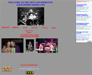
I know so little about all this stuff. I saw you on woot, and you are from colorado. I love woot and I am in colorado too. I get a bunch of hits on my site from people in Colorado as well. Hopefully you can help.
Your hair is pretty long, Jake, maybe you could lend me a hair tie? I just finished looking over your site, so I was hoping I could get some help holding my hair back while I deposit my lunchtime burrito into the toilet. And I don't even have long hair. Hopefully I can help, although I'm not certain anything short of a professional miracle will cull this monstrosity. Where do I even start?
Okay, let's start with your hosting. You own a domain name (jakethedrummer.com), why not pay the $4 a month to have it hosted somewhere you aren't forced to have ads? Geocities? Really? I remember making a website on Geocities more than 10 years ago. Believe me, you don't want to be a part of Geocities. It's pretty much the closest thing to being homeless on the internet. I understand you don't know much about this stuff, but a simple [insert favorite search engine] search will yield probably several million sites that can help you with the minutiae.
Now onto "design", or lack thereof. What the crap, man? Aren't you an artist, or do you not believe in the slash associated with "artist/musician"? Either way, a six-year-old Special Olympics shotput champion could come up with a more intriguing design than yours. "New and improved"? What did you do, completely resize your pictures so that they were completely incongruous? Change your background color from crap to crap? At least you have some sort of navigation, but sweet Moses, at least try to make your site appealing to your visitors.
If you want to be a halfway-decent developer/designer, you have to have some sort of photo-editing software. Photoshop is pretty much the industry standard, but there are plenty others out there that will do the trick. Here's what I would do if I were you ("crying myself to sleep every night" has been omitted):
- sit down and draw something on a piece of paper with a pencil.
- take whatever you just drew and tear it up because it sucks.
- grab a beer and drink it as quickly as you can.
- take your pencil in your hands, close your eyes, and try to imagine how your site should look. Try to think of common elements (maybe drums?) that could be worked into the design.
- start drawing what you see in your mind's eye (open your eyes first).
- repeat step 3.
- if you don't like what comes out, start at step 2. Eventually you'll either come up with something you like or be too drunk to realize how terrible it is.
- show someone else your idea. People other than yourself are usually good with telling you your work sucks.
- don't take negative criticism personally. They don't dislike you, just your artwork. Unless they specifically tell you, "I don't like you." If this is the case, offer them beer.
This is usually the creative process that I go through, plus or minus a few beers. Either way, if you at least sit down and put a modicum of thought into your design, you'll be better off than barfing on the keyboard and letting whatever key depressions result from the force of your vomit determine how your site looks.
Also, I'm pretty sure that you're using a WYSIWYG designer if you're using Geocities. While it may make design easier for you, it simply does not hold a candle (or a Halogen bulb, for that matter) to actually learning and understanding HTML and how it works.
I don't have time to go into detail about what else sucks about your site, so I will just list them here:
- You have a hit counter. Those went out of style with jorts (jeans shorts, for those who aren't hip).
- You have a guestbook. Normally, this would be eh, but you have no entries. That's just lame. At least get a family member to tell you they think your site is cool (it may take beer or inheritance percentage points to convince them, though).
- You have some random link to "This Day in History." Huh?
- No other page in your site looks anything like another, ie, your "bio" page doesn't even have a background color.
- Your picture page has all sorts of random pictures, but no explanation of what or who they are. Cool, you play drums and can pose with people no one knows. Who are they?
- Your contact link is a mailto of how you would post your email address in a forum. Very annoying. Either put it in there or don't.
I guess a suggestion I would have for you is stick with your MySpace site if you have no desire to actually put any work into making this site look good, because all you're doing with this site is hogging a domain name from some poor sap named Jake who fills oil barrels for a living.
Roses are red,
Violets are blue,
This is the crappiest website
I have ever been to.


4 Comments:
Roses are red,
Violets are blue,
This is the crappiest website
I have ever been to.
Me too. That red hurt my eyes.
Lol, ironic how you are a professional web designer but use blogger. Buried.
I don't understandthis, where is the relation between using blogger and web-design...
Jason you're website comments are cool!
OMG that was a funny review. I gotta go clean my shorts now.
Post a Comment
<< Home