Tutorial: Image Rollovers in Straight CSS
Hey everyone, and welcome to my second tutorial. My first one received such a positive response that I feel almost obligated to do another. So, I'm going to tackle one of the most annoying things people do on the development end of a website: image rollovers.
What's an image rollover? For those who don't know (which I'm sure is not too many; it's 2006, people), an image rollover is when you have an image on your page (usually a button, or link) that appears to change state when the mouse is passed over it, and then changes back to its original state once the mouse has left. You've seen this nefarious trick pretty much anywhere you go on the web. What you don't know is that 98% of the people who implement this design element do about 300% more work than they need, and in turn bloat out their code and add messy, unnecessary Javascript. This tutorial will show you how to replicate the image rollover effect using nothing but good, old-fashioned CSS and (X)HTML.
First things first: we need an image. Lo and behold, here we have one:
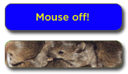
"Wait! That's two buttons!" No, Silly, it's one. Just hold on. Now, let's assume that for some reason, this button was in your navigation for your page where you feature all kinds of Off!s, such as Dance, Show, Blast, and , whose CFC-less contents are effective skeeter repellents (and smell like Deep Woods!). One of your new features is the Mouse Off! where mice get together to display their...uh...miceyness to...each other. Semantically, your navigation should be in the form of a list, ie:
<div id="nav">
<ul>
<li id="mouse-off"><a href="mouseoff.html">Mouse Off!</a></li>
...
(enter more Off!s here using the same format as above)
</ul>
</div>
This is the extent of your HTML code. Pretty easy, huh? Notice that I wrapped the code in a "div" tag and gave the div tag an id (not a class) as well as the "li" tag. Also notice how I have not used an image anywhere in my HTML code, and my link is a text link. WTF! you say. OMG! you bewail. Keep following. The truth will make sense soon.
The only thing that's next is to mess with the CSS. While it may be easy to just copy and paste the CSS I am about to give you, if you understand the concept behind the whole thing, you should be able to duplicate it later without even thinking, and when people do things without thinking, well, that's the American way.
Okay, imagine, that at your Mouse Off!, you have many aquariums full of mice. Aquariums? Yes, bear with me. Don't worry, there's no water in them, except to quench tiny mice thirsts. On top of these aquariums is, well, a top. When you pull the top off, mice! When you put the top back on, no more mice! This is essentially the concept. You have an image underneath and an image stacked on top of it, and when you pull the top off (aka, mouse over) you see the image underneath.
"So why the two buttons in one image?" This is for CSS simplification. With both of your button images in one image, you don't have to worry about more than one button per navigation element. So, here's the CSS in all its majesty (I apologize for the lack of indentation. I'm sure you understand):
#nav ul {
list-style: none;
margin: 0;
padding: 0;
}

#nav li {
list-style: none;
float: left;
padding: 0;
margin: 0;
}

#nav a {
display: block;
height: 54px; /* This assumes all your elements are the same height */
text-indent: -5000px;
overflow: hidden;
}

#nav a:hover {
background-image: none;
}

#mouse-off {
width: 187px;
background: transparent url(../images/btn-demo.gif) no-repeat 0 -54px;
}

#mouse-off a {
background: transparent url(../images/btn-demo.gif)
no-repeat 0 0;
}
Let's break this up into mouse bites, or go definition by definition. First, all you're doing here is relieving the "ul" tag of any duties. It thanks you. Next, you are ensuring that your buttons appear horizontally. If you don't want this effect, get rid of the float: left; property.
The third block is where some of the magic starts. Text-indent -5000??? Yeah, I wrote it. This neat little trick shoves your text link into a virtual closet 5000 pixels off your page. Now, in IE6, this has no side effects aside from minor headaches and male pregnancy, but in Firefox and other browsers, when you click your button, you get a little box that shoots off your page in a desperate attempt to rescue your forsaken text link. In order to cut this attempt off at the knees, we use the overflow: hidden; property. Nifty, no?
The next block defines the action that occurs when the mouse is placed over the button. Well, technically, the "link" (or "a" tag) that we have so previously, futurely, and precisely defined with a width and a height and a display: block; property. Basically, this definition says that when you mouse over the "link", the background disappears! Viola! Cello! Trombone!
I forgot to mention that in all the previous blocks, we still hadn't defined anything specific to our one button. This is so any buttons you create within this "div" and unordered list inherit the same properties without further coding. Now, to the button specific code:
#mouse-off {
width: 187px;
background: transparent url(../images/btn-demo.gif) no-repeat 0 -54px;
}

#mouse-off a {
background: transparent url(../images/btn-demo.gif) no-repeat 0 0;
}
First, you are setting the width for this individual button. If all your buttons are the same width, you can set this property in the #nav li definition. Usually, this is not the case, so I'm providing you with the more common occurrence because I'm good like that. Next, you are defining the background unique to this button, which in our case is the image with two buttons posted above. Remember that #mouse-off is the id attribute for our "li" tag, so this first block of code is describing the "li", not the "a". Notice how I set the position of the image to 0 -54px. This sets the "li" background to that of the mice, which we hope to see only on mouseover.
In the next block of code, all we're doing is shifting the position of the background image to the upper-left-most corner which starts the initial image we want the users to see before mouseover. Remember, we set the a:hover class to remove our background, so when someone moves their mouse over the button, this background disappears and the only thing they see is baby mice!
Here's the finished product (NOTE: I had to modify some of the names above to avoid conflict with my existing CSS structure, but everything else is the same):
- Mouse Off!
- Go ahead, you know you want to.
One last thing: If you want to repeat this effect with more buttons, all you have to do is add more "li" tags with id's and their respective element definitions in the CSS.
So there you have it! Easy as pie, cake, or even piecakes. Sure this was a long post and it seems like it took you forever to get here, but if you look back at the simplicity of the code, you'll realize that most of this post was superfluous BS and me trying to be funny. Enjoy, and I hope this helps you with your future buttoning endeavors.


15 Comments:
Any suggestions for making this work with links that utilize different rollover images?
yes! just create another element (#your-element) {} and #your-element a {}, set the width and the the image to be flopped. From the post:
#mouse-off {
width: 187px;
background: transparent url(../images/btn-demo.gif) no-repeat 0 -54px;
}
#mouse-off a {
background: transparent url(../images/btn-demo.gif) no-repeat 0 0;
}
Just modify that for each individual button. Cheerios!
Your css rollover are very compact and "elegant" thank you.
Do you also have an elegant solution for avoiding the columns going on top of each others in a three columns CSS layout upon browser resize which would not involve fixing the size of the wrapper div?
Thx,
Gilda Dadush
of course! the secret to simplifying three column CSS div structure is actually making it two columns. the easiest way is if you know the widths of your columns. float your first one to the left with its set width, you don't even have to float the second one so long as it will fit in width-wise. then, pick which column (first or second) you want your third column to go, and just float it whichever way you want inside that column. magico! three columns. it's a little harder to pull off if you don't set your widths, but you should at least set them to percentages if nothing else.
Thx. Did not really work, and in fact there are tons of sites around which show the same problem, so I will hide my head under the sand and hope that my public will not resize their windows. I will try it again when not under deadline. Cheers
I don't understand where to place this in blogger. I've tried adding a page element, and the "editing html" blogger feature to no avail.
Update: I CAN get this to work in a separet CSS \ html page stored on my hard drive, but not with blogger. Any help is much appreciated.
Is there any reason that it might be bad to simplify your code:
#nav a:hover {
background-image: none;
}
#mouse-off {
width: 187px;
background: transparent url(../images/btn-demo.gif) no-repeat 0 -54px;
}
#mouse-off a {
background: transparent url(../images/btn-demo.gif)
no-repeat 0 0;
}
Into...
#mouse-off a {
background: transparent url(../images/btn-demo.gif) no-repeat 0 0;
width: 187px;
}
#mouse-off a:hover {
background-position: 0 -54px;
}
(And I would probably also move the id to the anchor, with this code)
I was wondering why you set the background to two different elements. Is there a performance difference between hiding the background compared to shifting it up and down? A browser compatibility problem perhaps?
The second approach seems cleaner to me.
~Thanks, just curious.
Chuckles -
If you do it your way, there is a flicker in IE as the browser takes a split second to re-position the image. Kind of like when the power company is warning me they're about to shut me down until I pay my bills. Except that usually involves me losing fingers. I typed this with my toes.
Hope that helps
hOW DO YOU DO THIS IN bLOGGER??
First, crack open another beer (clearly you've had several already). Second, read the post. Third, follow the post's instructions.
For some reason, I feel like this answer is not helpful. Hmm...
how if make rollover picture moe than 2 pics?
FANTASTIC tutorial. Seriously.
This was a thousand times easier than anything I found on the web. Kudos. Thanks!
As for the drunken blogger.. I just did mine in blogspot like this:
Add the css code into "edit html" (where you edit your template)
And add the individual picture code into a page element "html code".
If you want to check it out:
supermama101.blogspot.com
Hello Edelman
I have created a roll over image in Serif Drawplus X2...now whilst it will roll over in preview in the IE browser, it will not work when exported to blogger.
Can you help?
Thank you.
Actually, I'm more than happy to find this educational post. This tutorial is definitely great for young researchers who are working on their present home works!Keep up the good work!
Post a Comment
<< Home