Do It For The Kids
<prologue content="gratuitous">
So I woke up this morning three minutes before my alarm went off (the most annoying thing ever), scratched myself, checked the stats for this site, and noticed a ridiculous spike in hits. Then I checked my email and saw that Anthony (see previous post) posted this site on digg.com. Thanks, man!
Yeah, I made an account and dug my own site. I got a little excited, okay?
</prologue>
And now...
Lisa, world-saving webmaster of http://www.littleworksusa.com writes:
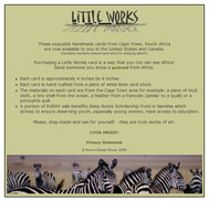
Is it possible to get my site evaluated? I will be doing some minor modifications on the code to ensure it is 100% valid next week.Lisa, one thing my dad always told me is anything is possible. However, after belligerently insisting that he drink all the water in the world without swallowing an octopus, I was promptly grounded. So, on to your very evaluatively-possible site.
First, I respect your eleemosynary intents with your site. I hope that this site sends some business your way so that your charity can be helped. Second, thank you for providing me with the opportunity to pedantically and publicly display my knowledge of how to use the word eleemosynary. Moving on...
One of the first things I noticed with your site is that your homepage is pretty much a "gateway" page to the rest of your site. While you do have some content on this page, generally I wouldn't recommend going about it like this. Instead, try to put as much information (ie, content) relevant to your site as you can possibly fit within good design constraints and without making old people go blind. Also, on your homepage should be links to other areas of your site. This helps with search engine spidering, since your content (aside from your prominent privacy statement) is currently at least two clicks away, making it three levels deep. Spiders can be lazy sometimes, so you want to provide them the least path of resistance in getting to your content.
Your homepage design is clean, albeit not too exciting. You've got a pretty good color palette set up, in my opinion, and you can probably do a lot using the theme from your home page. I do like the rotating image at the bottom. But you have to do more with your homepage, because I can pretty much guarantee that you're losing visitors who don't see anywhere else to go but your privacy statement and some magical place called "Inside."
So what is this wondrous land of Inside? Well, it is a relatively unformatted playground for animated .gifs and over- and undersized columns. The first thing you see upon being granted entry to Inside is two pictures with purple boxes around them smack in the center of the page. There are two reasons I would get rid of the purple border:
- Purple (and that shade, specifically) is the default color for visited links, making me think for some reason that I have already seen the content to which these pictures link. It was not until closer inspection that I discovered that this purple border is actually part of the image, and not a link-visited-status indicator. If you want an example of what I'm talking about, look at your "subscribe" button image.
- Because it looks like the border around a picture from it being an image link, it looks very amateurish. In CSS, you can prevent this border from appearing around pictures like so:
img { border: none; }, or you could simply put aborder="0"attribute in your<img>tag.
In regard to your columns (and we're talking strictly the column sizes themselves), your left column is okay, since it is your navigation, but your middle and right columns are grossly mis-sized. Do you see how much real estate you waste in your middle column? You could be putting content in that space that people would read if they made it past your homepage. This space grows depending on the user's lust for screen size and resolution.
I know many people are proponents of liquid layouts, and there are times to use them, but when you don't have enough content to fill one out, you might want to think about fixing your widths, especially if you're not changing your content all that often. Your right column, while aiding the illusion of symmetry by being the same width as the left column, is choking your largest chunk of content. From left to right: keep, shrink and fix, expand.
Okay, what's next. Ah, yes. Design. Lisa Pisa, you gotta do something about it. African art (and just the theme of Africa) is so cool that making a design based on it should be pretty easy. Maybe you don't have a graphic editor like Photoshop, but like I've said before, there are plenty of freebies out there you could download and use.
Right now, I hate to say it, but your site is simply visually unappealing and confusing to navigate. In your left column, I don't know what are links and what is text without mousing over everything. It just seems like you threw this site together in a hurry to get these cards on the internet. Believe me, both you and your customers would be better served if you sat down and really worked on a cohesive, intelligent design.
Get rid of your animated .gifs. Lord, how I hate them. They pull your eye away from what you really want your visitors to see, which is your content.
Which brings me to the next item—content. You don't have any! Aside from your smushed right column and your "About the Cards" page, your site is virtually devoid of content. Where are the textual descriptions of each card, the history behind the site, or anything else you can talk about that people (and search engines) might be interested in? Write something!
I'll leave your code alone for now, since you are endeavoring to fix it, so my last bit will be on your "shopping" area. Unfortunately, your site is a prototype for why it is wrong to purchase third-party vendor shopping cart applications, and it's not all your fault. Usually, these apps are very inflexible when it comes to design, and they are more about "getting the job done," which seems to be the case with your cart. Sure, people can buy from your site, but will they?
When they click the "Go SHOPPING" link on your main site, they are nightmarishly ripped from their care-free playland of Inside and violently thrown into the Matrix construct program where you happen to be selling stuff. Ironically enough, (Warning: movie reference) people are just as disoriented and unwilling to accept the truth upon entering your shopping area. Although, Keanu would probably be more likely to understand if Laurence Fishburn would have told him that the truth was that he hadn't done enough to save the African children and that he should buy one of your cards.
Like I said, this isn't entirely your fault, but if I were you, I'd do a bit more research on my shopping cart vendor before I settled on one. Like I tell my clients, having a lot of solid content (in your case, products) is great and 100% necessary, but if you have a crappy design, no one will take you seriously as a professional and will most likely not purchase from you.
Now, in keeping with yesterday's popular theme, a summary in tanka:
Lands in Africa
And the sad, hungry children
Will benefit if
You redesign your website
And add a lot more content
Readers: purchase these postcards to aid this cause!


1 Comments:
Jason.. thanks for your evaluation of Little Works. Much food for thought.
Post a Comment
<< Home