More, More, More!
The finger is a bit better today, and I can type relatively pain-free. I will attempt to keep it away from the lethal combination of ground and size 12 cleats.
Tony writes:
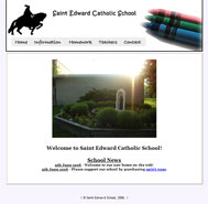
I am currently working on a site for the local private school. If possible, I would greatly appreciate some critique on the site. I am also having trouble trying to get it in Google. I used those things that submit your website to 200+ search engines, but all I got were a bunch of spam.Tony, I've definitely got some helpful comments for you. But first, a few questions. Is this the official site for this school? If so, how robust do they want it to be? By the looks of it, it doesn't appear to be much more than a simple brochure. I can't imagine any other reason to visit this site other than to get directions to the school. I see there is a space for "Homework" where you will probably list assignments, but unless you have a sophisticated back-end, I don't see this being updated frequently enough for it to be useful.
The site is available for viewing at http://www.stedschool.com
Okay, onto the critique. We mentioned the homework page above, so let's start with that. "Under Construction" logo and/or text: always a no-no. Get rid of it immediately and replace it with some text explaining what the future use of the page will be. Optimally, the page will not be included at all until it is completed, but since it's already in your navigation, you might as well do something with it for the time being, "Under Construction" not being an option. It's amateurish and very annoying for users looking for something to read. Do you really want 1000 kids thinking their homework assignment is to dig a hole on in their front yard? Poor school secretary :)
Anyways, let's go to design. It's very simple, but not in the good way, unfortunately. It's far too simple to realistically be any school's official website. I understand you're in the process of building it, but there's no better time than before you really get into adding meat to the site to alter or enhance your design. Think about planning out what you want your site to include, like sections and subsections (also called "information architecture") and write this down. Then include some sort of clear sub-navigation for when users use the main navigation (not non-descript links at the bottom of the page). I know this paragraph started with design, but you can see how closely the two are intertwined.
More about design: do you really want your site to feature crayons? I understand it's a school for younger kids, but realize that those three crayons take up prime real estate on your page. Why not include pictures of some kids in the classroom, or a frontal shot of the school building (better than the one on your home page though. The lens flare is killing me). The horse logo is fine, as it represents your school.
Your page is confined to 600 pixels wide. This size is usually recommended for emails, but websites are recommended to be around 800 pixels wide. While there's not a lot going on in your site now, if there ever may be, you might find the 600 pixels to be a bit restrictive. Also, you've got to do something about the centered text. Use it in moderation, like for page titles and not much else. Something nitpicky I just noticed: your homepage main text area border is different than the border on every other page of your site.
Your code seems to be fine, as it validates, although it does appear that you have not completely separated your code from your design with CSS stylesheets. As for your content, though, it's a bit on the weak side. You really don't have much at all to say, and this could be a major reason why you're not getting traffic from search engines. In order for people to find you, you need to have something for them to search for. And yeah, submitting your site to "200 search engines" is always a bad idea. There are only three search engines that you need to worry about, Google, Yahoo!, and MSN, as they deliver over 90% of search engine traffic.
Summary: more design, more structure, more content.


1 Comments:
Thanks a bunch for the review. I will try and remember to place a link back to you as soon as possible.
I am going to go into Dreamweaver & Photoshop right now and start working on your comments.
Post a Comment
<< Home