Don't Link Out, Homey
Well, still in crisis mode over here for one of the sites I built. Apparently the server went down early yesterday morning and still isn't up. I'm not a happy one right now. However, the good news for you guys is that there's really nothing I can do at this point, so that frees up some time for me to do a quick review!
Jon, proud father of www.dlc4me.com, writes:
Just looking for an overview - design comments, coding usage.. etc. This site is a mix of hand coded and GoLive generated (much reworked by hand) code... somethings are not validating but most have been fixed. My main push over the last few weeks has been toward a tabless design (css only) and I still have much left - many areas are table centric and ther are still some inline / absolute css seed lieing around. If you have time I would mind you reviewing the siteJonny, you do some good things with this site, and you do some naughty things with this site. What you do well is your php/xml scripting works loverly, and I'm sure it is easy to update. Your navigation is only mildly confusing, and your design is clean and consistent, although I don't know how much I agree with the palette.
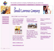
Something that is not so good about this site is that you have several links on your homepage (and throughout your site, as well) that take the user to another section of the site, but pops up in a new window. This is bad. If you're taking a user to another part of your own site, keep them in the same window, unless they're downloading a .pdf or something, or they're clicking an ancillary link from a page with a form they must fill out (like a policy of sorts). No one wants to have a window pop up in front of them that is either mis-sized or unscrollable. Similarly, you have links on your homepage that link to other sites. Unless you have a good reason for this, this is usually a no-no. You want to retain visitors. No one came to your site to see visitsequoia.com. They came for you, Jonny.
One last thing about your links on your home page is about your non-links. You have what appears to be anchor text, but no links, such as "Advice on buying your first home..." or "Check out our Mortgage Calculator...". Does your site have these features, or are you just trying to get your visitors a little taste of what's coming later (if ever)? My suggestion would be to get rid of any link text portending eventual linkage if you don't have the page to back it up. It's confusing, and annoying.
Imagine a guy named Jonesy. He just got a divorce with his rich wife and took half because she wouldn't sign a prenup (they were in love!). The money is burning a hole in his pocket, so he decides to buy a house. He shows up to your site, still slightly distraught from his recent traumatic divorce, and really wants to calculate his mortgage. He begins clicking furiously on the plain, innocuous text suggesting the existence of a mortgage calculator, until all of the sudden, his mouse breaks. With gritted teeth, he begins ripping out his hair at the prospect of never being able to check his email again (because he is clearly a lamer) and begins lighting things on fire. He begins to shriek maniacally and throw flaming objects around his apartment, eventually catching the curtains and the entire apartment building on fire. Since he no longer has any personal possessions and somehow managed to hold it together long enough to blame the arson on the cat which he never owned ("Poor Mr. Pretzels...little guy never had a chance"), he is forced to move back in with his ex-wife and continue with his miserable existence in...misery ("Do you do anything to help around here?"). All because you teased him with the prospect of a mortgage calculator.
Moving on, some design elements of your site may turn off users looking for a more professional-looking site, such as the squeezed, irrelevant, low-quality images in your header. What are those people doing? Are they looking at a blueprint or a sushi menu? Is the dude on the left, like, totally showing his arm candy where his "dude's only room" is going to, like, go and stuff? Or are they at Home Depot? People looking to drop 200-300k on you are probably looking for something a bit more polished. Think about it: would you rather go buy a car from Bob's Cars whar ya git a free greell with evrah parchiss or your Certified [insert favorite make] Dealer?
As for code, you mentioned you're aware of the messy code. It's good you're aware and attempting to fix it, because it's not great. You need to use a stylesheet to separate your design from your code, ie stop using inline styling (for instance
<div style="position:relative;width:720px;height:65px;-adbe-g:p;"> [I don't even know what -adbe-g:p; is, but I can tell you it's invalid], should be something like <div class="someclasswithallthosestylesinit">). You also have no keywords or descriptions on any of your pages, which may have an effect on your search engine rankings (although how much of an effect is debatable). You use javascript for rollovers, which does nothing but make your site less accessible and bloated. See my last tutorial for what I consider to be the best way to do image rollovers without resorting to javascript.I will say this, though. Your site does present some decent content and a somewhat reasonable navigation structure—two very important elements to a website. Table structure is not a bad thing, so long as you're using tables to present tabular data. For instance, it is completely semantically correct to place your housing listings in a table, since they are being presented as tabular. You're not using the tables to contain design elements (although they are formatted, which is fine), just data. Some people go crazy with divs and want to place everything in a div (aka "divitis"), but a div is not always the best or correct tag to use in all situations.
So, for your summary. Hmm...let's go with rap?
So I go to your site and I see it's all pink
The first thing I think is "holy crap, this site stinks,
He's got some crappy pictures and some outgoing links
So I blink, I stare, and I look a little closer
And take another sip of my matinal mamosa.
The structure's all right and the nav is okay,
But rollovers using javascript make users roll away.
So you say, "Is there any way to make them stay?
I kinda wanna use the site to sell a house today."
I say, "Okay, man, look. The external links gotta go
Somewhere else inside your site where they're less apt to show.
And while you're at it, clean up your messy code.
Don't you know that CSS and tables don't flow?"
Then I jump into my whip and I spin my twenty-twos,
I swing my chain, bling out my cane and spit my gangsta ruse.
I roll nice and slow givin shout outs to my crew
Whose quotidian behavior is reading my site reviews. WHAT
Fix, fix, fix, fix my site.
Fix, fix, fix, fix my site (oooh yeah) x4


1 Comments:
Very interesting points. I actually hate the colors my self (pink, and its dirivitives are not my forte), but I hadn't thought about the header photos. I guess they are too general. Will drop those externals. (maybe just deport them to a lesser page) I thought about tables for the inventory page... when I coded it though, the inventory was small, so what the hay... divitis struck. The inlines have been receiving the axe lately. A note to many out there: Don't use GoLive - or any other layout prog - their just too messy. The invalid css "-adbe-g:p-" is some bull GoLive drops in... along with some interesting junk from the live images. Back to the header - should I just drop the images all together or opt for some logo imposed homebuilder stereotypical splashy noise?...
Ah the dead end links... hehe. Only hope a few lost their heads over that one. Will be dropping those asap.
Popups remain a debate over here, I've been against them but the designer and the sales manager seem to 'love' them.... :p After I rid the office of them, I think I'll manage.
BTW the php/xml has been a major time saver for me... gone the days of hand coding updates... beer... yah for beer... er em I mean php!
Post a Comment
<< Home