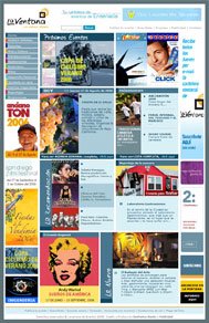
Ay, Mami!
No, your eyes do not deceive you. Here before you lies, yes, a site review. See? Didn't I tell you all those days of laborious blog refreshing would be worth it? Thus, I will not tantalize you anymore. Behold:
Mayred, la dueña de http://www.laventanadeensenada.com/ principal/principal.php escribe:
Well I'm from Mexico and me and my husband are begining to develop sites for living..... and as i love your site, i would like to hear your opinion about this one.
The edition team now is working on filling the whole information, that's why the link is not just [link],we develop an administration module there's where the editors fill the all information.
So, what do you think?
I'll say it in a way you will understand best: hay cosas buenas y hay cosas horribles. Now, to appease everyone else, I will repeat in various dialects and accents:
- Southern (not Texas): Thar some good'ns n' some 'at ain't so good.
- Asian: You hava gooduh tinguh ana so vewy bada tinguh!
- Southern (Texas): Ya got sum good aynd ya got whut looks like sumthing Billy shot behahnd that thar barn.
- African-American: Yo what it is, cuz, you got some good shizzle, you know, and you know you got some bad shiznit, know what I'm sayin?
- Snooty English: Oh deah. Beatrice, it appeahs as though Maynahd has come up with a piece of whehk containing both good and bad elements. A spot of tea?
- Californian/Stoner/Frat Guy: Duuuude! So, like, your site and stuff? Dude, it's like totally cool and like totally lame and stuff.
- New Yorker: Fugeddaboudit.
If maybe you didn't understand any of my attempts at being as PC as possible, I will put it in plain English for you: there's some good here and some bad. Let's start with the good, shall we? We shall.
I like the design. Really, I do. You keep it consistent throughout the site, which is a plus. Consistency is a major part of the user experience. You'd be surprised at how many people leave sites because they get confused, thinking they're actually at a different site and lose trust in the original. Your design is colorful and your design concept is bold and simple. You've got what appears to be a decent amount of content, and best of all, no blatant ads! Users love going to sites where they're not bombarded by ads constantly. Although, they also love sites that do have ads, but, not because...of...the ads. Comprende? I mean, people will still keep going to Yahoo!, even though you can't go anywhere without someone asking you to try their new pill or go check out their awesome new movie that will gross single-digit millions in the theaters. Also, I do like your navigation. It is clear and not really all too confusing. Your images appear to be good quality and not stretched, and your little Flash widget is pretty cool.
Okay, bad time. There's a lot of bad, sadly (not sadly for me, of course!). First off, your design is one of your biggest downfalls. "Espera...qué? No acabaste de decirme que el diseño es la mejor parte de mi website?" Well, yes, but it's also one of the worst. When I look at the site, my retinas catch fire and I go into epileptic shock. What the crap is with all the colors? Colorful is good, but you don't have to use every freakin' color around! While you do limit the colors to sections, you have so many sections that some colors are so similar to others that they can get very easily mistaken. Also, the design of your content is horrendous. When I'm looking for something, I don't want to read anything all the way through because there's too much information everywhere. While it looks clean, I can't imagine someone going to a page and reading all six or more boxes you have in each section.
And don't get me started on the code. Okay, too late. I've started. Your code is horrifying. Table-based design, no DOCTYPE, javascript popup window functions, and although you have some CSS, you have a lot of inline design. What happens if you decide you want to change your color scheme from something Crazy Mexican to something more Rico Suave? Tu no puedes muy facilmente! ([Southern (not Texas):] Ya cain't do it, I reckon).
All in all, Maynard, you've got a solid foundation on which to build. It may take a while, but I would say the biggest change you should consider making is going from a table layout to a div layout, and maybe doing something with your color palette. Maybe your target audience will like all the colors, because remember, I'm probably not your target audience. But I know as a human being, I can't stand clutter and eyestrain, so you might want to do something about that.
Tune in next time, when I do a review on a website! It will be bold, it will be outrageous, it will be spectacular. Check back every few minutes or so. You may get lucky and be the first to comment on my next review!


2 Comments:
I know you haven't heard this in a while, but you are hysterical. I honestly could care less about what is needed to set up a good website, and yet I still "check back every few minutes or so" to see what funny comments you are going to include in your next review. This review being one of the funniest so far. Have you thought about making a career of writing, because I sure as hell would pay money to read your commentary no matter what the topic. Thanks for finding the time to write again!
Soooo TRUE!
Post a Comment
<< Home