Going Blind, Going Crazy, and Advice From Rafiki
Phil, concoctor of www.purpledogpromotions.com, writes: 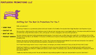
Yeah, I know my site sucks, but the bottom line is that I'm a new business and I cant afford to have someone to it so it that it looks slick and real purrty and then NOT be able to fix or add stuff on my own. I'm too busy tring to sell stuff to learn how to make hot looking websites.
Wow. Holy wow. Deep breath...whew. Okay.
Phil, I am proud of you. You are one of a rare breed of Those Who Have Accepted The Fact That Their Site Sucks (TWHATFTTSS), which it, in fact, does. Although, it would have been much better had you asked me to review your site because you thought it was awesome, because that would have at least justified that popping sound that I kept feeling behind my eyeballs as I slogged through your site.
To quote a wise sage, "You tried your best, and you failed miserably. The lesson is, never try." While I understand that your time is limited, and if you don't know anything about building sites, learning can take some time, there are certain occasions when you just simply should not try. I hope to [deity] that you have not placed this site on the business card you hand out to potential clients/associates, because I'm afraid they might visit it. If I were you, I'd keep this puppy (pun could not be more intended) under wraps until you can either get enough time to learn some HTML or make enough sales to hire someone to do this for you professionally.
So what exactly is wrong with your site? Aside from everything, let's start with a few of the most glaring problems. For one, if I wanted to go blind, I could do one of several things:
- stare at the sun
- flush my eyes out with bleach
- try to read all the text on your site
Unfortunately, I would say that the latter is probably the most painful. The yellow background has got to go. Typically, a good background choice is either white, black, or some muted tone that black or white text will look good upon. For instance, if you were really hell-bent on having a yellow background, you could kick it down a notch (maB?) to something along the lines of #DCE87A. This hex-code is a color closer to scrambled eggs than Big Bird Flying Into The Sun While Covered In Ignited Sulphur. If you don't like scrambled eggs, I suggest you try some of mine, because they are delicious. The reason this shade is so much more appealing (although, not much, it's just better than BBFITSWCIIS) is because it is less distracting from your content. This goes for pretty much any color you can find in a box of eight crayons. Be creative; mix it up.
So, that was an incredibly unnecessarily long diatribe on the evils of poor background color choice. Next is an incredibly unnecessarily long diatribe on the evils of incongruous rollover images. Now, I've seen a lot of things since I've been doing this schtick, from dueling marquee texts to enough blinking .gifs to induce epilepsy, but I've never seen someone consciously decide to create a navigation image rollover that shrinks upon rollover. While I would never recommend enlarging the image, I can at least understand the sentiment. But shrink it? Ow...there's that popping sound again.
Instead, Philip, I would recommend something a bit less jarring than throwing your page completely out of whack, since your potential clients (may [deity] have mercy on [possessive] soul(s)) probably won't like chasing your content all around the page. Try creating an image rollover in CSS (not using all that crazytalk javascript) that is the exact same size, but does something different, like changes colors or changes the background. In Web 2.0 (since, you know, I'm like, an expert, and all), flashy is out and subtle is in. Gone are the days of big crazy flashing images and lens flares and tin foil hats in the sun, and now we are in the era of muted tones and, well, non-flashy...ness. People just don't like all that distraction. If Content is King, Design is Queen, so that means that Design has to do what the crap Content tells it to do. Okay, maybe that's not really a good use of that analogy, but you get the point. Design caters to content, not the other way around.
However, (prepare for metaphor extension) no king would be complete without his queen, and right now, I think your kingdom is in turmoil. The peasants are revolting, your grain stores are low, and the Mongrels from the Land of No Design are beating down your walls, screaming threatening ululations and pounding their hairy chests with hairier fists. What sayest thee, O humble steward of the vast, mighty kingdom of Purple Dogia? Wilst thou allowest the wretched scoundrels overrun thine life's joy and ancestral glory? Or wilst thou fight, (tongue roll) rrrise up and create a cool design that will engage and delight viewers from all over the Land?
I do apologize for slipping into crazy Shakespearian soapbox mode, but the Jason back in that last paragraph has a point. You need to come up with a design of sorts, because right now your site looks like the inside of a very, very sick baby's diaper. He would suggest that you read my tutorial on how to create a valid XHTML page and try to model yours after it, and I agree. At least that will give you a leg up on the coding (get it? Get it? Purple dog? Leg up? That, my friend, is wit.), leaving only a bit of minor CSS training to really turn it into something hot (get it? Hot Dog? I am on fire today.). Perhaps I'll do some sort of intro to CSS tutorial in the future. Stay tuned for that. Like, seriously, don't leave.
A few more things—you need some pictures. You sell products, and relatively common ones, too, so one would imagine you would display your wares for the world to see. Do you think someone would really purchase a something from your site if they can't see what that something is first? Unless they are blind (which, now that I think about it, maybe that's the demographic you were after, in which case, ignore this entire review. Great content! Amazing site! Otherwise—), there's not a chance this side of your dwindling client base that they'll make a purchase on your site.
So, in summary, I know you're short on time, I know you're short on money, I know you're short on internet knowhow, and I know you're short (word on the street, man). What I would do is wipe everything you've got clean off your server and wait until you have either the time, money, knowhow, height, or any combination thereof. I know it's not what you want to hear, but as the wise baboon in the Lion King says, "The truth can hurt." This is of course before he cracks open an indiscernable fruit, wipes it on a lion, and begins to laugh and dance maniacally.


5 Comments:
Dude, #DCE87A is green. What kind of scrambled eggs do you make?
ehh...it's got some green in it. mostly yellow, though. kind of like scrambled eggs with a splash of guacamole. mmmm....
oh god, i had a good laugh with your web site reviews...but still wonder why you don´t put all that in practice in your own blog. lack of time, energy...? i mean, your site is clearly enough to be understood and read well, but it needs the "special touch" (i´ve just made this up), something that make it appear nicer to visitors. i don´t know, maybe i´m just talking nonsense here at 2.00 AM (local hour in spain), instead of going to bed. however, your blog was appealing enough to keep me awake. congratulations!
I prefer a more direct approach...WE WANT MORE! You can talk about doing your laundry for all I care.
I would disagree with the "wait until you have knowledge."
Yes, the site is hard to read; yes, it could use pictures. Therefore, I wouldn't expect this website to drive any business directly to me.
However, if you have a business and you don't have a web page, that in itself drives business away. If somebody *knows* they want to do business with you because you're the only useless-plastic-item seller in the area (gotta support those sweatshops!), they look you up online. If you're not there... they go to that other website they found online.
Post a Comment
<< Home