Fix My Site

Does your site suck? Do you need professional advice? Do you not want to pay for this advice? Send me an email, and I'll take a look at your site and provide you with some real suggestions. By real, I mean real.

Monday, September 25, 2006

Mrah, How Do You Like My Design, Mildred?

Hang (the proper noun, not the verb), banger outer of www.fastmoneyrally.com grovels:Fast Money Rally

I'm currently a college undergrad and I'm pretty much self/google taught in web/graphic design. I've no formal training and I'm really starting to think that it's catching up to me. I have only a working knowledge of HTML, as in I know what the tags mean and all, I just can't write a single line of it. Dreamweaver is my crutch. I still don't know what CSS and PHP and all that OMFG/LOL does. I feel like I've hit the ceiling in the stuff that I can create. I really need a nudge in the right direction to get to the next level in my work.

Well, Hang, if it's a nudge you want, you've come to the right place. Usually my methods include jabs, backhands, and fists to the heart, but if all you need is a nudge, I'm all for it. As for learning what all that OMFG/LOL is, I suggest you talk to my 10-year-old cousin. She knows all that OMFG/LOL better than anyone I know. She'll send me a message and it will be something like, "hi, yt? ok, ttyl! ly! haha lol," and I will sit there and ponder the direction America's youth is headed. Then I'll go to Taco Bell and eat ten tacos and immediately feel better about myself. I wonder if kids have started integrating acronyms into verbal conversation (assuming people still actually express themselves via oral interaction), like if someone thinks something is funny, they actually just blurt out, "L. O. L!" instead of actually lol-ing. Interestingly, this brings me to my next point.

I've got to say, Hanger, if this design is wholly your own, you're a talented designer. The graphics do an excellent job of conveying the connotive hoity-toitiness of this event, as the motif drips with snoot. I can just hear the participants' supercilious badinage: "Mrah, well my supercar is fueled by a delicate mixture of the finest caviar and Cristal champagne. Mrah!" This is perfect, since anyone who owns a car worth more than the Gross National Product of Estonia clearly talks like this and thus are the only people attending this event. So, great job on the design. My only gripe is on the "Why" page, where your links at the top blend too much with the background, making them very difficult to read. If I can't read it, I ain't clicking on it.

Okay, so wipe that goofy grin off your face, because now we're going to get into your coding. I was trying to come up with some terms that could describe it; "horrific" and "painful" were two that came to mind. However, I didn't feel that these terms fully expressed the disdain I felt for your coding, so I settled on the Yiddish term "challucious", since one of the language's strengths is the expression of disdain. Maybe that's a bit harsh, since you do keep your code somewhat organized and you haven't abused tables to the point of counseling, but that's about the extent of what's good code-wise. You use a lot of inline styling and tag attributes, which will make your page extremely difficult to update should the Baron of York and his French poodle Muffy decide they want you to fix the spacing on every page. You mentioned you lean on Dreamweaver a lot. Don't. Check out my tutorials to find helpful (not to mention witty and charming) examples of how to create an XHTML compliant site and image rollovers without using Javascript.

Scrolling text? Um...get rid of it. The reason why "tickers" exist is because of the dearth of space and surplus of information in the location where they're needed. Unfortunately for your site, this is not the case. It would be much more legible and far less annoying to just write down the information you want to say in a static way. It's like the advent of domestication: why chase your dinner all over the place when you can just capture it and breed it within a contained environment for multiple dinners for little effort? Clearly the same thing. Moral—get rid of scrolly text, or you may go hungry.

Your navigation is clear, but your titles don't accurately reflect the location the user is at. I clicked on "Why" and the title still said "How". I don't know, that's why I clicked "Why". If the how is the same as the why, then I think you have more of a problem on your hands than the Duke of Arlington taking a pitstop with a few of those models. Correct metadata is only slightly less important than the actual content itself, but only slightly. Remember that search engines store your titles, so what's a user supposed to think when two pages labeled "How" pop up when they're really looking for why? You know what they think? Lawsuit. It's the American way. Additionally, you need to add some keywords and a page description to fully sate the SEses hunger for meta-eats. And boy, are they hungry.

I suppose the last thing(s) I have for you are try to be less dependent on Javascript and figure out a way to tidy up those images on your "Why" ("How"?) page. In regards to the former, your image gallery, while it may appear cool at first, falls apart for someone who does not have Javascript enabled. Try to come up with some sort of alternative for those less fortunate than yourself, you self-serving chauvinist. Not everyone can afford your fancy schmancy Javascript. Oh, yeah, not all those buttons lead to pictures either (but one of them leads to blondes, so A+ on this page).

In summary: excellent work on the graphics, learn XHTML and CSS, rely less on Javascript (you selfish pig) and include more pictures of scantily clad models. Like I mentioned in my last post, be on the lookout for a CSS tutorial and maybe an aggregation of some other resources on how to learn this crap. Oh, and if you get the chance, go ahead and put in a good word for me to the Thane of Bismarck, or whoever you're working for. Mrah!

Thursday, September 21, 2006

Going Blind, Going Crazy, and Advice From Rafiki

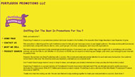
Phil, concoctor of www.purpledogpromotions.com, writes: Purple Dog Promotions

Yeah, I know my site sucks, but the bottom line is that I'm a new business and I cant afford to have someone to it so it that it looks slick and real purrty and then NOT be able to fix or add stuff on my own. I'm too busy tring to sell stuff to learn how to make hot looking websites.

Wow. Holy wow. Deep breath...whew. Okay.

Phil, I am proud of you. You are one of a rare breed of Those Who Have Accepted The Fact That Their Site Sucks (TWHATFTTSS), which it, in fact, does. Although, it would have been much better had you asked me to review your site because you thought it was awesome, because that would have at least justified that popping sound that I kept feeling behind my eyeballs as I slogged through your site.

To quote a wise sage, "You tried your best, and you failed miserably. The lesson is, never try." While I understand that your time is limited, and if you don't know anything about building sites, learning can take some time, there are certain occasions when you just simply should not try. I hope to [deity] that you have not placed this site on the business card you hand out to potential clients/associates, because I'm afraid they might visit it. If I were you, I'd keep this puppy (pun could not be more intended) under wraps until you can either get enough time to learn some HTML or make enough sales to hire someone to do this for you professionally.

So what exactly is wrong with your site? Aside from everything, let's start with a few of the most glaring problems. For one, if I wanted to go blind, I could do one of several things:


  1. stare at the sun
  2. flush my eyes out with bleach
  3. try to read all the text on your site

Unfortunately, I would say that the latter is probably the most painful. The yellow background has got to go. Typically, a good background choice is either white, black, or some muted tone that black or white text will look good upon. For instance, if you were really hell-bent on having a yellow background, you could kick it down a notch (maB?) to something along the lines of #DCE87A. This hex-code is a color closer to scrambled eggs than Big Bird Flying Into The Sun While Covered In Ignited Sulphur. If you don't like scrambled eggs, I suggest you try some of mine, because they are delicious. The reason this shade is so much more appealing (although, not much, it's just better than BBFITSWCIIS) is because it is less distracting from your content. This goes for pretty much any color you can find in a box of eight crayons. Be creative; mix it up.

So, that was an incredibly unnecessarily long diatribe on the evils of poor background color choice. Next is an incredibly unnecessarily long diatribe on the evils of incongruous rollover images. Now, I've seen a lot of things since I've been doing this schtick, from dueling marquee texts to enough blinking .gifs to induce epilepsy, but I've never seen someone consciously decide to create a navigation image rollover that shrinks upon rollover. While I would never recommend enlarging the image, I can at least understand the sentiment. But shrink it? Ow...there's that popping sound again.

Instead, Philip, I would recommend something a bit less jarring than throwing your page completely out of whack, since your potential clients (may [deity] have mercy on [possessive] soul(s)) probably won't like chasing your content all around the page. Try creating an image rollover in CSS (not using all that crazytalk javascript) that is the exact same size, but does something different, like changes colors or changes the background. In Web 2.0 (since, you know, I'm like, an expert, and all), flashy is out and subtle is in. Gone are the days of big crazy flashing images and lens flares and tin foil hats in the sun, and now we are in the era of muted tones and, well, non-flashy...ness. People just don't like all that distraction. If Content is King, Design is Queen, so that means that Design has to do what the crap Content tells it to do. Okay, maybe that's not really a good use of that analogy, but you get the point. Design caters to content, not the other way around.

However, (prepare for metaphor extension) no king would be complete without his queen, and right now, I think your kingdom is in turmoil. The peasants are revolting, your grain stores are low, and the Mongrels from the Land of No Design are beating down your walls, screaming threatening ululations and pounding their hairy chests with hairier fists. What sayest thee, O humble steward of the vast, mighty kingdom of Purple Dogia? Wilst thou allowest the wretched scoundrels overrun thine life's joy and ancestral glory? Or wilst thou fight, (tongue roll) rrrise up and create a cool design that will engage and delight viewers from all over the Land?

I do apologize for slipping into crazy Shakespearian soapbox mode, but the Jason back in that last paragraph has a point. You need to come up with a design of sorts, because right now your site looks like the inside of a very, very sick baby's diaper. He would suggest that you read my tutorial on how to create a valid XHTML page and try to model yours after it, and I agree. At least that will give you a leg up on the coding (get it? Get it? Purple dog? Leg up? That, my friend, is wit.), leaving only a bit of minor CSS training to really turn it into something hot (get it? Hot Dog? I am on fire today.). Perhaps I'll do some sort of intro to CSS tutorial in the future. Stay tuned for that. Like, seriously, don't leave.

A few more things—you need some pictures. You sell products, and relatively common ones, too, so one would imagine you would display your wares for the world to see. Do you think someone would really purchase a something from your site if they can't see what that something is first? Unless they are blind (which, now that I think about it, maybe that's the demographic you were after, in which case, ignore this entire review. Great content! Amazing site! Otherwise—), there's not a chance this side of your dwindling client base that they'll make a purchase on your site.

So, in summary, I know you're short on time, I know you're short on money, I know you're short on internet knowhow, and I know you're short (word on the street, man). What I would do is wipe everything you've got clean off your server and wait until you have either the time, money, knowhow, height, or any combination thereof. I know it's not what you want to hear, but as the wise baboon in the Lion King says, "The truth can hurt." This is of course before he cracks open an indiscernable fruit, wipes it on a lion, and begins to laugh and dance maniacally.

Thursday, September 14, 2006

Where Count Cookie the Grouch Goes Tanning

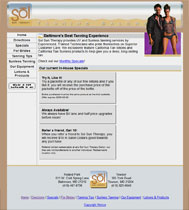
Jeffrey, the solar power behind www.solsuntherapy.com, quoth: Sol Sun Therapy

"Fis my site" or, at least, take a peek at it. Well, I don't think its all that broken, but I'd be curious to get your opinion.

So you don't think it's broken, eh, Jeffy? Is that a challenge? Am I supposed to find something "broken" about your site? Fine, I shall.

So after some extensive research, a few lab rats, a howler monkey (oh man did I learn why they're called "howlers"), and some protein synthesis, I've discovered where your site is so broken, it may as well be shattered into a billion tiny pieces and strewn over the ocean to be ingested by phytoplankton and sea turtles. Your CSS doesn't validate! Sucka! Aw right, still got it.

Okay, so, really, that's the only thing structurally wrong with your site, so despite my best efforts to make you feel like crap about this awful piece of junk you've submitted to me, it's really not that bad. Granted, you pansied out and went with the hippy doctype of HTML 4.01, but it validates, so I can't really give you too much crap, except you should probably go ahead and make it XHTML at some point in the nearer-to-when-you-started-reading-this-sentence future. So, broken, sadly, no. Are there things that suck? You betcha! Plus, I know you loved my sentence where each word had a comma after it. Only people with degrees in that crap can do that and get away with it, so I wouldn't suggest it.

Let's talk about your design. To be fair, it's a good start. To be unfair, you could do a lot better. Don't get me wrong, I like rotating women as much as the next guy (or girl who is of that orientation [if she prefers rotating women (unless she prefers rotating guys and girls, in which case, this is not the same)]), but the fact that you only have two draws a lot of attention to your lack of (image) pimpin' abilities. Maybe add a few more pictures to that feature to keep it a bit fresher, as you know how everyone loves fresh womens.

Also, I know you were going with the whole transparent cutout image thing with the separation of the header section from the body, but honestly it looks a bit disjointed. This could be because the body does not match the head at all, kind of like those make-your-own-character things where you could pick the head, body, and feet from Sesame Street and then name it Count Cookie the Grouch or something. In this case, your site would be named Licenseplate Plainwhitebox Plaingreybox, instead of Sol Sun Therapy. Since your header is rounded you have three options:

  1. Delete all your files and start from scratch
  2. Flatten out the bottom of your header and connect it to the body
  3. Round out the corners of your body
I understand these may sound like scary changes to you, since you seem pretty well set on your design, but believe me, the third option is really easy as pizza and beer should do the trick. Basically, what I'm saying is that your design lacks continuity, which is a bit jarring for your visitors. Additionally, there's enough unused space in the main section of your site to put an embryonic elephant. I would suggest you fill that with a grey sidebar like you have in your "sunless tanning" or a picture of another hot chick, but hey, that's just me (Adriana Lima and Maria Sharapova are not being suggested or hinted at). Remember, your homepage is the furthest most people will get on your site, so giving them as much eye candy as you can without sending them into epileptic shock is a good idea.

Let's talk metatags for a second here. It won't be a long talk, since you have none, so I would suggest you put them (them = keywords and descriptions) in, and make them unique to each page.

It appears that your content is pretty good and unique, although I will admit I didn't look at other tanning websites, but for the love of Pete check your spelling! "Packette?" Is that like a tiny packet, analogous to a "towelette", "kitchenette", "Rockette", or "Corvette" being diminuitive versions of towels, kitchens, Rocks, and Corvs? And Nothing Is More Annoying Than A Sentence Where The First Letter Of Every Word Is Capitalized To Construe Faux-Importance Of The Sentence Or The Subjects Being Capitalized Within. Funny how you can literally hear the deep, haughty voice saying that sentence. Well, at least I can. Um. Moving on.

I suppose my only other gripe about this site is that it took me at least three tries to figure out what the little button at the bottom of your navigation says. "Wear a fan unearth if all?" Ok, Yoda, whatever you say. Oh, one more thing. This is nitpicky, but since you've submitted yourself to my scrutiny, too bad: the text in your footer should be smaller, since you want to distinguish it from the rest of your content. The footer is purely informational and should not be so prominent on your page. Shrink your bottom logo and shrink your text, and you could probably drop the height of your page by like 150px.

All in all, you have a very good start to what could be a very decent site. The design is not horrible, the coding stomachable, the navigation clear, albeit discriminatory (what if a groom and his buddies want to have a tanning party?), and the structure not overly complex. Just a couple more hot chicks, and this site could maintain a regular audience (did I hear a suggestion for a "Hot Chick of the Day" feature [which is, of course, completely acceptable to capitalize egregiously]?). Good luck.

Edit: I just looked at your site in IE7. Imagine shattered pottery. That is all.

Monday, September 11, 2006

Jason's Valid (X)HTML Skeleton Tutorial

It's been a while since my last tutorial (or since my last post, even) and I've been getting some clamor in my inbox about what I consider to be the best way to create the (X)HTML portion of a site. The truth is, many people are pretty clueless when it comes to where they should begin. That big, white text editing box can be a bit daunting when you're not totally certain how you should go on. Is there a "right" way? A best way? Well, the answer is, as Confucious would say, "Der are many right way, but no best way." End of tutorial.

Zzzinga! Got you good, I know it! Clearly you have peripheral vision and could see that there was more to this tutorial than just that one paragraph, so welcome to the portion of the show I call, "Jason's Valid (X)HTML Skeleton Tutorial".

This tutorial will show you how to create a valid XHTML, two-column layout that is CSS-ready and inline-styling free, kind of like your favorite diet pop/soda/coke. And don't worry, no skeletons were harmed in the making of this tutorial because, well, skeletons are not...living.

Okay, enough crap. First things first: Doctype. The very first thing your page needs in order to be (X)HTML compliant is a doctype. If you are scratching your head, knee, or face trying to figure out why I keep putting the X of (X)HTML in parentheses, you should probably stop, because it's a bad habit and it won't help you figure it out any more quickly. The reason is because the X stands for "eXtensible" HTML, which is slightly different (and easier!) than regular HTML, but my model will work in both X- and HTML. Why isn't it EHTML? Because we're not Canadian, and everyone knows the letter X is way cooler than the letter E. But I digress.

Doctype - your doctype determines how your site is going to be validated. There are several different forms of (X)HTML, and your doctype tells the validation parser which one it should use to validate your site. Of course there are things such as custom doctypes where you can create your own HTML tags, but that's outside the scope of this 'tute. For this 'tute, we're going to use XHTML Transitional simply because it's a good segue between HTML 4.0 and XHTML Strict, which is where most browsers are going to be in the very near future.

Your doctype and leading <html> tag should look like this:

<!DOCTYPE html PUBLIC "-//W3C//DTD XHTML 1.0 Transitional//EN" "http://www.w3.org/TR/xhtml1/DTD/xhtml1-transitional.dtd"><html xmlns="http://www.w3.org/1999/xhtml">

This line is cAsE-sEnSiTiVe, so make sure that you type this in correctly. Or, better yet, just copy and paste it and save yourself the trouble.

Before we get into the XHTML model, I'll go over a few of the main elements that comprise XHTML (and separate it from regular HTML), and should be included even if you stray from my model.

  1. ALL TAGS ARE IN LOWERCASE.
  2. Every tag needs a closing tag, ie <p></p>
    • There are a few exceptions, such as <br /> and <img />, which are considered "empty elements", which basically means that it doesn't need a closing tag because there's nothing you can put between the opening and closing tag. Many meta tags are empty elements as well.
  3. All <img /> tags must have an "alt" attribute.
  4. Attribute values must always be in quotes, ie <img src="me.jpg" alt="This is me after my eighth beverage." />
  5. Tags must be closed in the order they were opened.
  6. If any special characters are used, such as & or —, they must be used with their character counterpart, such as & for &, or &mdash; for —
  7. If you use the "id" attribute, you can only use it once per element. For instance, you can't have two div tags with the same id attribute.

This covers some of the biggies. For more info on the smaller stuff, go here: http://www.w3.org/TR/xhtml1/ or just validate your page and find out where you messed up.

Okay, so now you know what XHTML sort of is and you have a doctype and an <html> opening tag. What now? Try this:

<head>
<title>Your Title</title>
<
meta name="Description" content="Your description" />
<meta name="Keywords" content="Your, comma delimited, keywords" />
<
meta equiv="content-type" content="text/html; charset=utf-8" />
<meta equiv="imagetoolbar" content="no" />
<
link rel="stylesheet" type="text/css" media="all" href="your-css-stylesheet.css" />
</head >

Hopefully blogger or whatever feedreader you're using parsed that correctly...sometimes they won't, but if you're lucky enough to be able to read that, congrats! You know how to make a header section! Let me briefly explain what is pretty much self-explanatory:

  1. Title: duh. The title of your page.
  2. Description, and Keywords: duh. Written meta information about your page. May or may not be important to certain search engines, but always a good idea to have.
  3. That "imagetoolbar" thing: it's not exactly necessary, but it's good to have in there because it turns off that annoying little toolbar in IE6 that pops up when the user mouses over an image. I like this meta tag, so I hereby declare it part of the skeleton. Which is mine anyways, so I can do with it what I will. So there.
  4. Stylesheet: this is where you connect your CSS to your page, because you're not putting your styles at the top of each. That's just gross and dumb, and my skeleton is pretty and smart.

After you put in your header, put in a <body> tag and you're ready to get started! Okay, well, you're ready to copy and paste some more.

What I'm going to introduce to you now is what is the latest and greatest in cutting-edge XHTML technology, your buddy and mine: Div Structure. Div Structure is the savior of the internet, riding through your CAT5 cable on a tiny white horse and a halo around His head. Or if you're on WiFi, He's in a billion pieces above your head, in your nose, and underneath your fingernails, to name a few. Okay, so maybe Div Structure can be a bit "invasive" but he is still the easiest thing around, outside of Candy, the creepy lady with pink hair and ripped pantyhose who is always hanging out at the gas station and seems to like you for reasons you can't comprehend.

Imagine that div structure is sort of like those Russian dolls that pop out from one another with a teenier one inside of the last, except that divs are not made out of wood and they're a lot easier to decorate. Also, instead of only being able to fit one doll inside each preceding doll, you can fit as many as you want in there because the outer doll is made of like, rubber, or very quickly growing hair, or something. If you're familiar with table structure, this concept may be new and different and frustrating to you, but believe me, it's an improvement in more ways than I can list here.

The first part of our div structure skeleton is going to consist of a main "wrap", which is essentially a div that goes around everything. In fact, we are going to name the div "wrap" for simplicity's, Pete's, and chri's sake. So, after the body tag, add <div id="wrap"> </div> with some line breaks in between the opening and closing tags so you can add more Russian dolls (metaphor extension? eh? eh?).

Below the wrapping div tag, you're going to place another div without anything in it with an id of "top". "What the deuce am I doing wasting a div tag for?" you sputter, incoherently, to your imaginary friend. Well, Mr./Mrs. Darryl and Debbie Downer, I've found in my years as a developer, this div can be helpful for things such as jump links and even adding auxiliary imagery. Also, its placement there semantically correct because it is, technically, at the top of your content. While you're at it, you can place a div tag with an id of "bottom" right below it for the same reasons, opposite style. Everything you make now is going to be between your "top" div and your "bottom" div.

Now to the meat of the skeleton (irony?)! My skeleton consists of just a few basic elements (just like you!):

  1. Header (head)
  2. Content (body)
  3. Side column (pancreas...?)
  4. Footer (arms)

Of course, every site is not this simple. You may wish to add certain features to your skeleton, such as adamantium claws, or another eye socket, or a flash widget. But I've found that even though this structure is very simple, it is very adaptable to pretty much any situation you could throw at it, should you harness the ability to hurl concepts at...code. So for the basics:

Create a div with the id of "header" and close it, inserting line breaks. In fact, from now on, when I say "create a div named _____" the preceding instruction is what I mean, so just DO IT, okay? Inside this div is where your logo and main navigation are going to go. At the top of every page you should have a logo that links back to the home page of your site, because, well, that's how we roll in Web 2.0. It frees up a space in your main navigation (ie, you don't have to have a space for "Home") and it's pretty much a best practice amongst the big sites (and some little ones) on the net. Be sure to put your image in a <p> tag. This, along with its double-wishbone suspension, will give you more control for a greater feel and a smoother shave. Then go ahead and create an unordered list with your main navigation elements. If you want, go ahead and give each <li> tag a unique id so that you can create pure CSS rollover imagery for your nav. Your header section should look something like this:

<div id="header">
<p><img src="logo.jpg" alt="Bob's Corncob Jobs" /></p>
<ul>
<li id="nav-about"><a href="about.html">About Me!</a></li>
<li id="nav-corn"><a href="species.html">Corn Species</a></li>
<li id="nav-violent"><a href="violent.html">Violent, Corn-Related Crimes</a></li>
</ul>
</div>

Of course your site is probably not about corn and the violent crimes associated with them, so you'll want to replace my sample text with something a bit more relevant to your site. All the code listed above this point is pretty standard and mostly won't change on every page. Almost everything below this point is going to (hopefully) be different on every page of your site. That's because it's your content. What I'm going to show you is, of course, not the only way to do it, nor the best way for your site necessarily, but it is a good starting point and the concept is sound, and I ain't talkin' 'bout music. Wow, two apostrophes in a row...talk about awkward.

Remember that talk we had about wraps? Yeah, it made me hungry, too, and it doesn't only apply to the outermost layer — you can use wraps anywhere, sometimes within other wraps. Remember those double-wrap tacos from Taco Bell? It's kinda like that, except less delicious. Anyways, for the content section of your page, unless you're not adding any other elements (ie, other divs) aside from text, you should create a div named "content-wrap" right under the close of your header div. What this allows you to do other than imagine food while you code is logically keep all of your content together, regardless of the elements it contains and what format they are in. It also helps to standardize your styling when you use CSS, since you can use various forms of cascading styles when you use wraps without having to rewrite a lot of BS CSS. Ergo:

<div id="content-wrap">
<div id="content">
<p>I am a bologna, cheese, and mayo sandwich with chips in the bread.</p>
</div>
<div id="some-other-element-named-logically">
<p>[insert random inane content here]</p>
</div>
</div>

Cool beans, daddy-o! You're almost done! "But wait," you interject, mouth full of kosher ham sandwich. "Where do I put my sub-navigation? How will my users know where to find my other pages within the section they are currently in?" First, where did you find kosher ham, and second, just add in a sub-navigation section, silly! The reason why you include your sub-navigation after all your content instead of before is for two reasons: accessiblity and SEO. Including your subnav (as it is referred to amongst we geeks) after your content means that if perchance someone using a mobile device, screen reader, or other vibrating instrument that does not allow CSS rendering happens to plod across your page, they will not have to sift through your 300 sublinks about the various properties of corn before they get to your content. It is good for SEO for the same reasons, as spiders are lazy, lazy creations that get tired after checking a few links and may never make it to your content.

(I realize this is getting [ha, "getting"] long, bear with me. You've been having fun and learning so far, though, no? Yes?) So, how do you make your subnav appear to the left of your content if it comes after it? Easy: CSS. First, create a div named "sidebar" right outside of your "content-wrap" div. This will become the cozy abode of your subnav. The reason we call it "sidebar", though, instead of "subnav" is because it is possible that you may want to include other things in that area of the page, like a link to my site. So, inside of "sidebar" create another div named "subnav" and jam all your related corn-growing technique page links into here in an unordered list, like so:

<div id="sidebar">
<div id="subnav">
<ul>
<li><a href="sunlight.html">Sunlight Grows Corn!</a></li>
<li><a href="water.html">Water Grows Corn!</a></li>
<li><a href="love.html">Love Grows Corn!</a></li>
</ul>
</div>
[insert link to Fix My Site here]
</div>

After you've created this sidebar, the way to sneak it up to the left of your content is via CSS. Without going into too much detail, basically fix the widths of your "sidebar" div and your "content-wrap" div to the sum of the width of the "wrap" div, ie 200 (sidebar) + 550 (content) = 750 (wrap, or sidebar + content). Then, float the sidebar to the left and the content to the right, and do the hokie pokie and turn yourself around. That is what it's all about.

Pressing on, the only remaining element to my skeleton are the arms: the footer. This is easy; create a div named "footer" and place some text links that mirror your main navigation in your header and your faux-copyright claim that no one can enforce. Bam! Eureaka! Calloo! Callay! You are done! Now wasn't that easy? I apologize for the relative dearth of information presented in this short tutorial, but hopefully I have presented you with a working model that you can use as a foundation for more crappy websites for me to revile.

For your reference, here's the full model in all its glory (shrunk down to save space):

<!DOCTYPE html PUBLIC "-//W3C//DTD XHTML 1.0 Transitional//EN" "http://www.w3.org/TR/xhtml1/DTD/xhtml1-transitional.dtd">
<html xmlns="http://www.w3.org/1999/xhtml">
<head>
<title>Your Title</title>

<meta name="Description" content="Your description" />
<meta name="Keywords" content="Your, comma delimited, keywords" />
<meta equiv="content-type" content="text/html; charset=utf-8" />
<meta equiv="imagetoolbar" content="no" />
<link rel="stylesheet" type="text/css" media="all" href="your-css-stylesheet.css" />
</head >
<div id="header">
<p><img src="logo.jpg" alt="Bob's Corncob Jobs" /></p>
<ul>

<li id="nav-about"><a
href="about.html">About Me!</a></li>

<li id="nav-corn"><a href="species.html">Corn Species</a></li>
<li id="nav-violent"><a href="violent.html">Violent, Corn-Related Crimes</a></li>
</ul>
</div>
<div id="content-wrap">
<div id="content">
<p>I am a bologna, cheese, and mayo sandwich with chips in the bread.</p>
</div>
<div id="some-other-element-named-logically">
<p>[insert random inane content here]</p>
</div>

</div>
<div id="sidebar">
<div id="subnav">
<ul>
<li><a href="sunlight.html">Sunlight Grows Corn!</a></li>
<li><a href="water.html">Water Grows Corn!</a></li>
<li><a href="love.html">Love Grows Corn!</a></li>
</ul>
</div>
[insert link to Fix My Site here]
</div>
<div id="footer">
[footer links]

<p>&copy; 2006 Your Crap Site. All Rights Reserved</p>
</div>

<div id="bottom"></div>
</body>
</html>