Fix My Site

Does your site suck? Do you need professional advice? Do you not want to pay for this advice? Send me an email, and I'll take a look at your site and provide you with some real suggestions. By real, I mean real.

Monday, August 28, 2006

Mitigation: The Fun Spoiler

Greg, the big cheese at www.gandmcomputers.com, writes: G&M Computers

Hey, I saw you on woot (great place to advertise).

I wouldn't call it "advertising". I would call it "offering".

I want some suggestions. There are definately a bunch of things wrong with it (a few of which are validation issues). I would be happy if you posted the review on your blog.

If me posting a review of your site will make you happy, Greg, then happy you will be. Of course until you read my review of your crap-a-dap site.

Kidding! I don't think your site is crap, Greg, I promise. As a matter of fact, I think it is mediocre, which is pretty good, relatively speaking (did you see my last post? Good lord!). Like most mediocre sites, there are some good things and some bad things. Normally I start with the good to really butter you up for the bad, but this time I'll do the same thing.

GOOD

Simplicity. Keeping It Simple, Stupid is a great methodology to create a good site. A lot of people will try to use every little javascript snippet and DHTML trick they know to make their site more "interactive", when all they're doing is really hindering their users' experiences. Know what happens when you hinder your users' experiences? You guessed it: no more users. Oh, maybe you guessed something else, like, "they want to fight you," or "they complain to the government," in which case you may be right, but really you're wrong. Lie to me and tell me that you guessed what I envisioned you guessing. Otherwise I have to go on this long tirade about how you guessed wrong and then the whole review has gone to waste.

Content. Each page in your site has a decent amount of unique quality content. When users come to your site, they will most likely know that they are at a legit company's website and not some sc/pammer's site. More pages and more content will be necessary for a truly good site, but I imagine that you're still in the development stage, so I'll leave it at that.

Congrats on using a div structure! Hooray! What I would suggest here though (I know this is in the "GOOD" section, but this seemed like the most logical place to put this) is that you make sure to name your divs according to their actual function, as opposed to their design function. Naming something "box_right" is simply a design function. What happens if somewhere down the line you want to redesign the site, but keep the content as-is? Maybe in your new design, the stuff in "box_right" will be on the bottom, or on the left. Now you have to go through each page and change the class name to "box_left" or something so that you don't get confused. Instead, name it something like "extra-info" and you can put it anywhere on the page you want without feeling guilty and eating a pint of ice cream.

Okay, enough hanky panky. No one wants to read the good stuff anyways. There was a lot to put down below this line, but I only chose a few. What fun is it if you don't get to figure some stuff out on your own?

BAD

At first when I tried to validate your site, I got all excited when I saw that neither your code nor your CSS validated. I prepared my scathing, mordacious remarks in my head and envisioned myself evilly chortling as I wrote them. Then I re-read your initial post and all my conniving machinations deflated when I saw your mitigating validation statement. Damn. Well, *sigh* yeah, it doesn't validate, but you already knew that. Moving on...

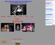
Your design could use some, how you say, "work". While Keeping It Simple, Stupid is good, Keeping It Too Simple, Stupid is a different acronym altogether that just doesn't make any sense. The most garish, glaring element of your design is clearly your advertisement for Firefox. Now we all know how much everyone loooooves Firefox because it's standards-compliant and all that yazz flute music, but at first glance, I don't know anything about your site except that maybe it's just another Firefox-worshipping site. There's nothing wrong with the promotion of Firefox, I mean, I do it on this blog, but let's be real: about 10% of the world uses Firefox and the other 89% uses IE, with .75% using Opera, .25% using something else, and a negligible amount of poor, starving orphan children in Germany using Macs. Poor Hans, Dorfunkel, and Jorgen. Anyways, the point is, regardless of what nonsense I just spouted, the thing is too big and too prominent on your page. Shrink it and move it, or lose it, sister.

Proceeding with design issues — your navigation. Ask yourself this question: why do I have a navigation system? Is it so users can go to other places in my site (ie, navigate) or so they can try to find where to go on my site only to have the link disappear from under their mouses (mice? mices? mooses?). When a user currently mouses over your navigation items, they turn white! This wouldn't be a problem if they weren't against a light grey/white background. Think about all the Alzheimer's patients that may go to your site. "Hmm...I think I'll click services. There it is. Hey! Where did it go? I'm hungry. Hmm...I think I'll click services." And so on, and so forth ad infinitum. This could be detrimental to your sales.

More design — on the left side of your main content where you have text that looks like it should take you somewhere else, it doesn't, because it's not linked. Link it.

Fresh and new computer builders, eh? What makes you so "fresh" and "new"? Did you guys just start a computer building company that talks smack to your mothers? What do you do that's different than everyone else? Do your mouses double as beer IV's? Can your CPU case double as a kegerator (if the answer to either of these statements is yes, where do I purchase?)? From the looks of your site, you don't do anything "new" or "fresh" compared to any other computer maker, especially the giants such as Dell or Gateway. Set yourself apart, man.

Two words: spell check. If a fifth-grader can spell "paroxysm", you can spell "explanation". (FYI, paroxysm is an awesome word. It's what I did when I first looked at the last site I reviewed, right before I went looking for a grill fork with which to gouge out my eyes.)

On your products page, you have an image map. This isn't bad, per se, but definitely a bit outdated. Remember back in the day when you would go to a site and it was just a big, honking image that you had to kind of figure out where to click in order to navigate? Yeah, I'm glad the 90's are over. Instead of using an image map, I would cut each image out individually and list them separately on the page with some sort of border or something, three to a row. Shouldn't be hard to do, especially with CSS. Also, it gives you a bit more flexibility should one of your products change or you add more products. Oh, and on your "dual screen monster" page, your image of your 2SM breaks your layout. Monsters will do that.

I would say something about your logo, but I have a feeling you like it, so I won't. Okay, I will. Is it supposed to look like an atom bomb? Ohhh, I get it, you guys are "da bomb". Clever! Maybe you should design your whole site to look like a giant atom bomb. Don't actually do that, though, but it would be funny. For like, a minute.

Okay, I guess the last thing I have for you is that you need to do something about your contact form. I just hit submit without entering anything and it just took it like the new guy in prison, no fight, no nothing. Add some validation and you should be good.

So, I know that I listed a bunch of things under the "BAD" section and not many under the "GOOD" but that doesn't mean anything, really. Listing the bad stuff is more helpful (and fun!), anyways. Don't be discouraged; I don't think your site is bad. You are in a good place right now to start. Put a bit more thought into your design, get rid of that god-awful Firefox ad, and do all the other things I mentioned and you should be well on your way to creating new, fresh computers that smell like evergreens and taste like cherry pie.

(Any word on that beer IV mouse? If you need venture capital, I will invest all the money I make in AdSense from this site [which is hundreds of thousands of dollars {eh, maybe not hundreds of thousands. Or even hundreds of...dollars}]. We'll be millionaires!)

Thursday, August 24, 2006

How To Appear Homeless On The Internet

Well slap my face and call me Charlie, it's another site review!
Jake, mastermind behind www.jakethedrummer.com, writes: www.jakethedrummer.com

I know so little about all this stuff. I saw you on woot, and you are from colorado. I love woot and I am in colorado too. I get a bunch of hits on my site from people in Colorado as well. Hopefully you can help.

Your hair is pretty long, Jake, maybe you could lend me a hair tie? I just finished looking over your site, so I was hoping I could get some help holding my hair back while I deposit my lunchtime burrito into the toilet. And I don't even have long hair. Hopefully I can help, although I'm not certain anything short of a professional miracle will cull this monstrosity. Where do I even start?

Okay, let's start with your hosting. You own a domain name (jakethedrummer.com), why not pay the $4 a month to have it hosted somewhere you aren't forced to have ads? Geocities? Really? I remember making a website on Geocities more than 10 years ago. Believe me, you don't want to be a part of Geocities. It's pretty much the closest thing to being homeless on the internet. I understand you don't know much about this stuff, but a simple [insert favorite search engine] search will yield probably several million sites that can help you with the minutiae.

Now onto "design", or lack thereof. What the crap, man? Aren't you an artist, or do you not believe in the slash associated with "artist/musician"? Either way, a six-year-old Special Olympics shotput champion could come up with a more intriguing design than yours. "New and improved"? What did you do, completely resize your pictures so that they were completely incongruous? Change your background color from crap to crap? At least you have some sort of navigation, but sweet Moses, at least try to make your site appealing to your visitors.

If you want to be a halfway-decent developer/designer, you have to have some sort of photo-editing software. Photoshop is pretty much the industry standard, but there are plenty others out there that will do the trick. Here's what I would do if I were you ("crying myself to sleep every night" has been omitted):

  1. sit down and draw something on a piece of paper with a pencil.
  2. take whatever you just drew and tear it up because it sucks.
  3. grab a beer and drink it as quickly as you can.
  4. take your pencil in your hands, close your eyes, and try to imagine how your site should look. Try to think of common elements (maybe drums?) that could be worked into the design.
  5. start drawing what you see in your mind's eye (open your eyes first).
  6. repeat step 3.
  7. if you don't like what comes out, start at step 2. Eventually you'll either come up with something you like or be too drunk to realize how terrible it is.
  8. show someone else your idea. People other than yourself are usually good with telling you your work sucks.
  9. don't take negative criticism personally. They don't dislike you, just your artwork. Unless they specifically tell you, "I don't like you." If this is the case, offer them beer.

This is usually the creative process that I go through, plus or minus a few beers. Either way, if you at least sit down and put a modicum of thought into your design, you'll be better off than barfing on the keyboard and letting whatever key depressions result from the force of your vomit determine how your site looks.

Also, I'm pretty sure that you're using a WYSIWYG designer if you're using Geocities. While it may make design easier for you, it simply does not hold a candle (or a Halogen bulb, for that matter) to actually learning and understanding HTML and how it works.

I don't have time to go into detail about what else sucks about your site, so I will just list them here:

  1. You have a hit counter. Those went out of style with jorts (jeans shorts, for those who aren't hip).
  2. You have a guestbook. Normally, this would be eh, but you have no entries. That's just lame. At least get a family member to tell you they think your site is cool (it may take beer or inheritance percentage points to convince them, though).
  3. You have some random link to "This Day in History." Huh?
  4. No other page in your site looks anything like another, ie, your "bio" page doesn't even have a background color.
  5. Your picture page has all sorts of random pictures, but no explanation of what or who they are. Cool, you play drums and can pose with people no one knows. Who are they?
  6. Your contact link is a mailto of how you would post your email address in a forum. Very annoying. Either put it in there or don't.

I guess a suggestion I would have for you is stick with your MySpace site if you have no desire to actually put any work into making this site look good, because all you're doing with this site is hogging a domain name from some poor sap named Jake who fills oil barrels for a living.

Roses are red,
Violets are blue,
This is the crappiest website
I have ever been to.

Friday, August 18, 2006

Ay, Mami!

No, your eyes do not deceive you. Here before you lies, yes, a site review. See? Didn't I tell you all those days of laborious blog refreshing would be worth it? Thus, I will not tantalize you anymore. Behold:

Mayred, la dueña de http://www.laventanadeensenada.com/ principal/principal.php escribe:La Ventana de Ensenada

Well I'm from Mexico and me and my husband are begining to develop sites for living..... and as i love your site, i would like to hear your opinion about this one.

The edition team now is working on filling the whole information, that's why the link is not just [link],we develop an administration module there's where the editors fill the all information.

So, what do you think?

I'll say it in a way you will understand best: hay cosas buenas y hay cosas horribles. Now, to appease everyone else, I will repeat in various dialects and accents:

  • Southern (not Texas): Thar some good'ns n' some 'at ain't so good.
  • Asian: You hava gooduh tinguh ana so vewy bada tinguh!
  • Southern (Texas): Ya got sum good aynd ya got whut looks like sumthing Billy shot behahnd that thar barn.
  • African-American: Yo what it is, cuz, you got some good shizzle, you know, and you know you got some bad shiznit, know what I'm sayin?
  • Snooty English: Oh deah. Beatrice, it appeahs as though Maynahd has come up with a piece of whehk containing both good and bad elements. A spot of tea?
  • Californian/Stoner/Frat Guy: Duuuude! So, like, your site and stuff? Dude, it's like totally cool and like totally lame and stuff.
  • New Yorker: Fugeddaboudit.

If maybe you didn't understand any of my attempts at being as PC as possible, I will put it in plain English for you: there's some good here and some bad. Let's start with the good, shall we? We shall.

I like the design. Really, I do. You keep it consistent throughout the site, which is a plus. Consistency is a major part of the user experience. You'd be surprised at how many people leave sites because they get confused, thinking they're actually at a different site and lose trust in the original. Your design is colorful and your design concept is bold and simple. You've got what appears to be a decent amount of content, and best of all, no blatant ads! Users love going to sites where they're not bombarded by ads constantly. Although, they also love sites that do have ads, but, not because...of...the ads. Comprende? I mean, people will still keep going to Yahoo!, even though you can't go anywhere without someone asking you to try their new pill or go check out their awesome new movie that will gross single-digit millions in the theaters. Also, I do like your navigation. It is clear and not really all too confusing. Your images appear to be good quality and not stretched, and your little Flash widget is pretty cool.

Okay, bad time. There's a lot of bad, sadly (not sadly for me, of course!). First off, your design is one of your biggest downfalls. "Espera...qué? No acabaste de decirme que el diseño es la mejor parte de mi website?" Well, yes, but it's also one of the worst. When I look at the site, my retinas catch fire and I go into epileptic shock. What the crap is with all the colors? Colorful is good, but you don't have to use every freakin' color around! While you do limit the colors to sections, you have so many sections that some colors are so similar to others that they can get very easily mistaken. Also, the design of your content is horrendous. When I'm looking for something, I don't want to read anything all the way through because there's too much information everywhere. While it looks clean, I can't imagine someone going to a page and reading all six or more boxes you have in each section.

And don't get me started on the code. Okay, too late. I've started. Your code is horrifying. Table-based design, no DOCTYPE, javascript popup window functions, and although you have some CSS, you have a lot of inline design. What happens if you decide you want to change your color scheme from something Crazy Mexican to something more Rico Suave? Tu no puedes muy facilmente! ([Southern (not Texas):] Ya cain't do it, I reckon).

All in all, Maynard, you've got a solid foundation on which to build. It may take a while, but I would say the biggest change you should consider making is going from a table layout to a div layout, and maybe doing something with your color palette. Maybe your target audience will like all the colors, because remember, I'm probably not your target audience. But I know as a human being, I can't stand clutter and eyestrain, so you might want to do something about that.

Tune in next time, when I do a review on a website! It will be bold, it will be outrageous, it will be spectacular. Check back every few minutes or so. You may get lucky and be the first to comment on my next review!

Tuesday, August 01, 2006

I'm Still Alive

Hi everyone-

I greatly apologize for my lack of posting for the past month. You see, I started my new job on the 5th of July and have been a busy little bee since. I appreciate everyone who has requested that the site continue, and honestly, I would like to keep it going because I love it and I think it provides a good source of information, entertainment, and good, old-fashioned ass-kickery in an easy-to-swallow etablet.

For those of you who thought I was going to say, "Unfortunately, I'm closing down this blog because I'm far too busy and important for you hoi polloi commoners," I say, "Suckas!" I'm not closing down this blog. At some point in the near future, I will pick up where I left off and begin bashing sites like I did in the good ol' days of May (although a new review every day may be a bit of a stretch). In fact, I may even get to a review sometime this week. But don't hold your breath, because if you do, well, you'll probably pass out and hit your head on something and wake up in a crusty pool of your own blood and drool with a headache and three less teeth. Or pregnant. Either way, I heretofore thereby formally declare myself not liable.

In all honesty, I really have been busy with my new job (which is like my last job, but about 1,582,892 times better, and nothing like my last job) but additionally, I have been contracted by someone whose site I reviewed to rebuild her whole site from scratch. And if you must know, we're through the design phase and into the coding phase. Exciting! Maybe if enough people want to see and she's okay with it, I'll post the comps here.

Anyways, I really do appreciate all your support and gripings, and I will attempt to get another lambasting up here sometime in the relatively near future. Relative, of course, to when you read this. Like, if you're reading this now, and there's still no new review, you are closer to the new review than if you read this, like, yesterday.

-Mgmt