Fix My Site

Does your site suck? Do you need professional advice? Do you not want to pay for this advice? Send me an email, and I'll take a look at your site and provide you with some real suggestions. By real, I mean real.

Friday, June 30, 2006

Don't Link Out, Homey

Well, still in crisis mode over here for one of the sites I built. Apparently the server went down early yesterday morning and still isn't up. I'm not a happy one right now. However, the good news for you guys is that there's really nothing I can do at this point, so that frees up some time for me to do a quick review!

Jon, proud father of www.dlc4me.com, writes: dlc4me.com
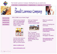
Just looking for an overview - design comments, coding usage.. etc. This site is a mix of hand coded and GoLive generated (much reworked by hand) code... somethings are not validating but most have been fixed. My main push over the last few weeks has been toward a tabless design (css only) and I still have much left - many areas are table centric and ther are still some inline / absolute css seed lieing around. If you have time I would mind you reviewing the site
Jonny, you do some good things with this site, and you do some naughty things with this site. What you do well is your php/xml scripting works loverly, and I'm sure it is easy to update. Your navigation is only mildly confusing, and your design is clean and consistent, although I don't know how much I agree with the palette.

Something that is not so good about this site is that you have several links on your homepage (and throughout your site, as well) that take the user to another section of the site, but pops up in a new window. This is bad. If you're taking a user to another part of your own site, keep them in the same window, unless they're downloading a .pdf or something, or they're clicking an ancillary link from a page with a form they must fill out (like a policy of sorts). No one wants to have a window pop up in front of them that is either mis-sized or unscrollable. Similarly, you have links on your homepage that link to other sites. Unless you have a good reason for this, this is usually a no-no. You want to retain visitors. No one came to your site to see visitsequoia.com. They came for you, Jonny.

One last thing about your links on your home page is about your non-links. You have what appears to be anchor text, but no links, such as "Advice on buying your first home..." or "Check out our Mortgage Calculator...". Does your site have these features, or are you just trying to get your visitors a little taste of what's coming later (if ever)? My suggestion would be to get rid of any link text portending eventual linkage if you don't have the page to back it up. It's confusing, and annoying.

Imagine a guy named Jonesy. He just got a divorce with his rich wife and took half because she wouldn't sign a prenup (they were in love!). The money is burning a hole in his pocket, so he decides to buy a house. He shows up to your site, still slightly distraught from his recent traumatic divorce, and really wants to calculate his mortgage. He begins clicking furiously on the plain, innocuous text suggesting the existence of a mortgage calculator, until all of the sudden, his mouse breaks. With gritted teeth, he begins ripping out his hair at the prospect of never being able to check his email again (because he is clearly a lamer) and begins lighting things on fire. He begins to shriek maniacally and throw flaming objects around his apartment, eventually catching the curtains and the entire apartment building on fire. Since he no longer has any personal possessions and somehow managed to hold it together long enough to blame the arson on the cat which he never owned ("Poor Mr. Pretzels...little guy never had a chance"), he is forced to move back in with his ex-wife and continue with his miserable existence in...misery ("Do you do anything to help around here?"). All because you teased him with the prospect of a mortgage calculator.

Moving on, some design elements of your site may turn off users looking for a more professional-looking site, such as the squeezed, irrelevant, low-quality images in your header. What are those people doing? Are they looking at a blueprint or a sushi menu? Is the dude on the left, like, totally showing his arm candy where his "dude's only room" is going to, like, go and stuff? Or are they at Home Depot? People looking to drop 200-300k on you are probably looking for something a bit more polished. Think about it: would you rather go buy a car from Bob's Cars whar ya git a free greell with evrah parchiss or your Certified [insert favorite make] Dealer?

As for code, you mentioned you're aware of the messy code. It's good you're aware and attempting to fix it, because it's not great. You need to use a stylesheet to separate your design from your code, ie stop using inline styling (for instance <div style="position:relative;width:720px;height:65px;-adbe-g:p;"> [I don't even know what -adbe-g:p; is, but I can tell you it's invalid], should be something like <div class="someclasswithallthosestylesinit">). You also have no keywords or descriptions on any of your pages, which may have an effect on your search engine rankings (although how much of an effect is debatable). You use javascript for rollovers, which does nothing but make your site less accessible and bloated. See my last tutorial for what I consider to be the best way to do image rollovers without resorting to javascript.

I will say this, though. Your site does present some decent content and a somewhat reasonable navigation structure—two very important elements to a website. Table structure is not a bad thing, so long as you're using tables to present tabular data. For instance, it is completely semantically correct to place your housing listings in a table, since they are being presented as tabular. You're not using the tables to contain design elements (although they are formatted, which is fine), just data. Some people go crazy with divs and want to place everything in a div (aka "divitis"), but a div is not always the best or correct tag to use in all situations.

So, for your summary. Hmm...let's go with rap?

So I go to your site and I see it's all pink
The first thing I think is "holy crap, this site stinks,
He's got some crappy pictures and some outgoing links
So I blink, I stare, and I look a little closer
And take another sip of my matinal mamosa.
The structure's all right and the nav is okay,
But rollovers using javascript make users roll away.
So you say, "Is there any way to make them stay?
I kinda wanna use the site to sell a house today."
I say, "Okay, man, look. The external links gotta go
Somewhere else inside your site where they're less apt to show.
And while you're at it, clean up your messy code.
Don't you know that CSS and tables don't flow?"
Then I jump into my whip and I spin my twenty-twos,
I swing my chain, bling out my cane and spit my gangsta ruse.
I roll nice and slow givin shout outs to my crew
Whose quotidian behavior is reading my site reviews. WHAT

Fix, fix, fix, fix my site.
Fix, fix, fix, fix my site (oooh yeah) x4
Thursday, June 29, 2006

Crisis

I apologize for the lack of post today (or at least so far today), but we're experiencing a crisis over here. If I should happen to get it fixed up at a reasonable time, I may still have time for a review. But I can't make any promises. Tomorrow I'll have one for sure. Thanks for understanding guys :)

-Jason

Wednesday, June 28, 2006

Tip for Newbies: Hire a Pro

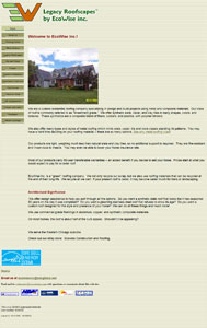
Dan and Ann, co-conspirators for www.ecowiseinc.com, write:
Great blog! I have enjoyed the education.
Thanks, I enjoy giving it.

We are lost (obviously), a middle aged couple starting a business that's time has come. I know you hate Frontpage, but it was highly recommended to us.... So that is what we used. We did hire a "pro" to help, but he did nothing but lower our bank balance. Nothing he did was usable.

How do you find a good site designer / developer, how long should the turn around be and how much should we expect to pay?

Our site is for education purposes, we don't sell on the site. We have received emails from other businesses who needed the info we offered & thanked us, so our content has some value.

We wanted a site that we could alter constantly, adding & changing text & pics without having to study software for months. Is there a simple way for amateurs to do a decent job on websites?

Okay, so I wrote pretty much your entire review, and then someone called and I picked it up and happened to drop the receiver on the keyboard and, well, you can guess what happened next. Sigh.

So here's a recap: I started off by calling you DAn(n), which is a clever conglomeration of Dan and Ann, then I made fun of people who have no fingers, then I made fun of newbies, displaying my usual pedantry with the use of big words like "tantamount" and "dilettante", then there was talk of monkeys eating honey, what ancient Inca tribes would do with optical computer mice, and the hilarity of snowmen playing full-contact football (think about it), and then I got to talking about your site. So, unfunny BS aside, here's what I remember of what I wrote before the Fall (of the stupid phone receiver):

Is there a simple way for amateurs to do a decent job on websites? Well, yes and no, but mostly no. Asking this is like asking a roofer, "Hey, do you think I could put this 200 square roof on by myself?" He will probably laugh at you, but only because he doesn't understand what you're saying, and then he will shout something at his buddy sitting on your roof, who may chortle. Yeah, you can put on your own roof, but if you don't know anything about roofing, how good of a job do you really expect to do? And come on, if you live in a house with a 200 square roof, you can probably afford to pay someone to do your website for you.

(Note: none of the above was in the original review. Also, probably none of the below was part of the original).

Basically what I'm saying is, web design/development is just like any other profession/hobby/fetish—those with experience are better than those without. What is unique about this industry is its ability to close that gap with technology, such as software. Now, using WYSIWYG editors, any Tom, Dick, or DAn(n) can put out anything they want, and it has the same availability and accessibility (in terms of being available to be accessed) as any other site out there, from the ones created by Toms, Dicks, and DAn(n)s to those created by thousands and millions of dollars. But, like I said above, thousands and millions of dollars usually will yield a better product.

Pretty much the only thing that the average layman (or sub- or super-layman) can do well without professional assistance or prior development/design experience is write copy. Writers can make great websites with just a modicum of design and development experience because they write great copy. In reference to your site, the one thing you can do you do well. Your content is excellent, as it is well-written, focused, unique, and informative, which gives you a leg up on about 80% of the internet. And, since search engines don't care what your design looks like, this is an extra boon.

Unfortunately, search engines aren't the only ones that you want visiting your site. People occasionally visit sites, too, meaning that aesthetics are of some importance. In terms of aesthetics, well, your site sucks. It looks like a powerpoint presentation gone horribly wrong. Your logo is grainy and of poor quality, some of your image links have blue borders around them, you have images randomly strewn amongst your text, your color palette is inconsistent and doesn't match itself, and your homepage with a ridiculous amount of unused above-the-fold space, has a picture with a date in the corner on it. I understand your site is for education purposes, but if I were looking for information on roofing, I would probably go somewhere like www.roofhelper.com. Not saying that this site is the end-all, be-all of professional sites, but if you compare yours to theirs, you can see why a user might be more likely to trust the information from their site.

I suppose we don't have to get into a discussion about your frightening code, since you guys are not really coders and used FrontTheDevilPage, but I will mention your lack of keywords and descriptions. Yes, they may not be of utmost importance, but I would rather err on the side of more content than less.

How do you find a good designer/developer? Hmm...I wonder where you could find one...:) I will admit, it can be hard, because anyone who knows HTML or has a pretty good grasp of a WYSIWYG editor can claim to be a professional. However, the best way to tell is to look at their work and compare it to other people's work. Another harbinger could be to look at their code, even if you don't know what it means. For example, take the code from your site and compare it to an example site from someone you're looking for. Do they look the same? If yes, tuck and run.

Summary, in pretentious freeverse:

One day, while the sun blooms like a flower on a jagged horizon,
While the tree quivers, still moist from its dewbath in the gloaming,
One day, amateur developers will be able to compete with pros,
and tyro designers will be able to express themselves perfectly on digital canvases.
However,
That day
Is not today.

Nor will it be tomorrow.
So if you want a website that glitters like gold,
and sparkles like exploded Fourth of July detritus,
Glue some glitter to your monitor
And shine it with a flashlight,
because you can't do it by yourself or with FrontPage,
Which is the Devil,
but you can hire someone
who knows
What they are doing,

And you will Achieve your
Dream
of Educating the masses
About the wonders
nuances, passions, techniques, and licentious desires
of roofing.

Tuesday, June 27, 2006

Tutorial: Image Rollovers in Straight CSS

Hey everyone, and welcome to my second tutorial. My first one received such a positive response that I feel almost obligated to do another. So, I'm going to tackle one of the most annoying things people do on the development end of a website: image rollovers.

What's an image rollover? For those who don't know (which I'm sure is not too many; it's 2006, people), an image rollover is when you have an image on your page (usually a button, or link) that appears to change state when the mouse is passed over it, and then changes back to its original state once the mouse has left. You've seen this nefarious trick pretty much anywhere you go on the web. What you don't know is that 98% of the people who implement this design element do about 300% more work than they need, and in turn bloat out their code and add messy, unnecessary Javascript. This tutorial will show you how to replicate the image rollover effect using nothing but good, old-fashioned CSS and (X)HTML.

First things first: we need an image. Lo and behold, here we have one:

Mice!

"Wait! That's two buttons!" No, Silly, it's one. Just hold on. Now, let's assume that for some reason, this button was in your navigation for your page where you feature all kinds of Off!s, such as Dance, Show, Blast, and , whose CFC-less contents are effective skeeter repellents (and smell like Deep Woods!). One of your new features is the Mouse Off! where mice get together to display their...uh...miceyness to...each other. Semantically, your navigation should be in the form of a list, ie:

<div id="nav">
<ul>
<li id="mouse-off"><a href="mouseoff.html">Mouse Off!</a></li>
...
(enter more Off!s here using the same format as above)
</ul>
</div>

This is the extent of your HTML code. Pretty easy, huh? Notice that I wrapped the code in a "div" tag and gave the div tag an id (not a class) as well as the "li" tag. Also notice how I have not used an image anywhere in my HTML code, and my link is a text link. WTF! you say. OMG! you bewail. Keep following. The truth will make sense soon.

The only thing that's next is to mess with the CSS. While it may be easy to just copy and paste the CSS I am about to give you, if you understand the concept behind the whole thing, you should be able to duplicate it later without even thinking, and when people do things without thinking, well, that's the American way.

Okay, imagine, that at your Mouse Off!, you have many aquariums full of mice. Aquariums? Yes, bear with me. Don't worry, there's no water in them, except to quench tiny mice thirsts. On top of these aquariums is, well, a top. When you pull the top off, mice! When you put the top back on, no more mice! This is essentially the concept. You have an image underneath and an image stacked on top of it, and when you pull the top off (aka, mouse over) you see the image underneath.

"So why the two buttons in one image?" This is for CSS simplification. With both of your button images in one image, you don't have to worry about more than one button per navigation element. So, here's the CSS in all its majesty (I apologize for the lack of indentation. I'm sure you understand):

#nav ul {
list-style: none;
margin: 0;
padding: 0;
}

#nav li {
list-style: none;
float: left;
padding: 0;
margin: 0;
}

#nav a {
display: block;
height: 54px; /* This assumes all your elements are the same height */
text-indent: -5000px;
overflow: hidden;
}

#nav a:hover {
background-image: none;
}

#mouse-off {
width: 187px;
background: transparent url(../images/btn-demo.gif) no-repeat 0 -54px;
}

#mouse-off a {
background: transparent url(../images/btn-demo.gif)
no-repeat 0 0;
}

Let's break this up into mouse bites, or go definition by definition. First, all you're doing here is relieving the "ul" tag of any duties. It thanks you. Next, you are ensuring that your buttons appear horizontally. If you don't want this effect, get rid of the float: left; property.

The third block is where some of the magic starts. Text-indent -5000??? Yeah, I wrote it. This neat little trick shoves your text link into a virtual closet 5000 pixels off your page. Now, in IE6, this has no side effects aside from minor headaches and male pregnancy, but in Firefox and other browsers, when you click your button, you get a little box that shoots off your page in a desperate attempt to rescue your forsaken text link. In order to cut this attempt off at the knees, we use the overflow: hidden; property. Nifty, no?

The next block defines the action that occurs when the mouse is placed over the button. Well, technically, the "link" (or "a" tag) that we have so previously, futurely, and precisely defined with a width and a height and a display: block; property. Basically, this definition says that when you mouse over the "link", the background disappears! Viola! Cello! Trombone!

I forgot to mention that in all the previous blocks, we still hadn't defined anything specific to our one button. This is so any buttons you create within this "div" and unordered list inherit the same properties without further coding. Now, to the button specific code:

#mouse-off {
width: 187px;
background: transparent url(../images/btn-demo.gif) no-repeat 0 -54px;
}

#mouse-off a {
background: transparent url(../images/btn-demo.gif) no-repeat 0 0;
}

First, you are setting the width for this individual button. If all your buttons are the same width, you can set this property in the #nav li definition. Usually, this is not the case, so I'm providing you with the more common occurrence because I'm good like that. Next, you are defining the background unique to this button, which in our case is the image with two buttons posted above. Remember that #mouse-off is the id attribute for our "li" tag, so this first block of code is describing the "li", not the "a". Notice how I set the position of the image to 0 -54px. This sets the "li" background to that of the mice, which we hope to see only on mouseover.

In the next block of code, all we're doing is shifting the position of the background image to the upper-left-most corner which starts the initial image we want the users to see before mouseover. Remember, we set the a:hover class to remove our background, so when someone moves their mouse over the button, this background disappears and the only thing they see is baby mice!

Here's the finished product (NOTE: I had to modify some of the names above to avoid conflict with my existing CSS structure, but everything else is the same):

One last thing: If you want to repeat this effect with more buttons, all you have to do is add more "li" tags with id's and their respective element definitions in the CSS.

So there you have it! Easy as pie, cake, or even piecakes. Sure this was a long post and it seems like it took you forever to get here, but if you look back at the simplicity of the code, you'll realize that most of this post was superfluous BS and me trying to be funny. Enjoy, and I hope this helps you with your future buttoning endeavors.

Monday, June 26, 2006

Lessons To Live By

It's Monday! You know what that means...

Andy writes: sleeptech.biz

...[O]ver the spring term I took an intro to web design class and www.sleeptech.biz was my final project. The business is my father in law's sleep lab. I know I did lots of things wrong, I plan on re-doing the site in the future, but for now mock me and tell me what I can inprove on for when I do find time to redesign it.

One thing I know already sucks is the buttons on the left on some of the pages expand out. I have no clue why this is so since they are in tables.

Anyway, be honest...I can take it!
This site is funny to me for a few reasons. First, a guy in my graduating class back in the day used to work for a company like this, and he got fired for both "gross incompetence" and "criminal negligence." He later was rehired for more money than he was initially making because he was the only person with the necessary qualifications for the job. Later he quit after they gave him a bonus and went to live in South America and then Colorado bumming everything off people. The second reason is because I think that RLS, or Restless Leg Syndrome is a funny name for a disease. C'mon, aren't there any Latin words you could have used? Resticus Legulus Syndrome, or something.

Anyways, to the site review. If this is your first site, I must congratulate you, because it's not terrible. It's not great, either, but all things considered, good job. You get your message across, the site isn't a complete mess, and hell, if you changed all your ID tags to single tokens (aka, "ContactUs" vs. "Contact Us") and fixed a few other minor things, your code would even validate as XHTML. Structurally the site is solid, meaning your architecture is navigable and logical.

Whoa, whoa, you didn't think that was it did you? I have to butter you up before I can flip you over, put cheese on you, and grill you (and then dip you in tomato soup. Delicious). While your effort is a commendable cherry-popping, you still have much to learn, Daniel-son.

Lesson 1: Metadata
You have zero metadata. You must come up with keywords that match the words you wish to deem important. These keywords will be unique to each page, since not all words will be included on each page. If you want "sleep apnea" to be a keyword on a page, you must include it in both your content somewhere on said page and in the keywords. The correct documentation for adding keywords is <meta name="keywords" content="keywords, go here, make sure, they, match your page" /> and include them within your <head> tag. Also, come up with unique page descriptions, which also belong in the <head> tag. The documentation is the same as above, but change the "name" attribute to say "description." Lastly, and probably most importantly, come up with a unique title for each page, make it very descriptive, but keep it short. Search engines are like doctors and bibliophiles: they love titles.

Lesson 2: Design
If there were one phrase I could use to sum up this design, it would be "wasted space." You have about 300 pixels at the top of every page (aka, prime real estate) that you do pretty much nothing with. There's something we folks in the biz call "the fold." The eponym is from newspaper; the context is stories that appear "above the fold" were considered to be most important and most likely to sell papers, because a lot of the time, it's all people would see as they walked by the newspaper machines. In the world of the internet, this thinking is very transferrable, but the definition of the fold is the point at which people must first scroll down. When people get to your site, most of the time they will not venture down or in, so you must include as much important/cool stuff in the top portion of your homepage as you can.

While this doesn't apply as much to your homepage, since you have no fold (which is good), you still have a lot of nothing at the top of your page (which is bad). The design is very 90's Frontpage, and by god, those buttons are horrendous. Later in the week I will do a tutorial on how to make image rollovers using only CSS. I suggest you take heed. The reason your buttons expand is because they're in a table that is not separate from your main body table. To keep them from expanding, put them in their own table inside a <td>, kind of like a wrapper <td>, and then set your valign attribute to "top". Of course, I would always recommend you don't use tables at all and use CSS, because of semantics, code- bloat reduction, ease of use, etc., but if you must use tables, that's how I would do it.

Lesson 3: Use CSS
Okay, this is kind of like Lesson 2.1, but it's important enough that you learn it now before you dive head-first into a pool of pain with no floaties, because in this pool of pain, CSS is your floaties. Right now, if you wanted to change something, like the width of the box that contains the main content, you'll have dip down into every page and fix it. While you do have a stylesheet, it's not nearly extensive enough. You have not completely separated your design from your content via CSS (metaphor extension: "float above your pages with CSS!"), which is something you must learn to do. While it may seem hard using a table layout, you still need to try. I would also suggest learning the concept of "div layout structure." It'll take a bit, since you're used to table design (I was a tabler, too, back in the day), but once you get the hang of it, you'll be amazed at how flexible it is, and how much extra work you were having to do with tables. Everyone knows that tables sink in pools of pain.

I like your "self-test" form. It has informed (pun so intended) that I show symptoms of insomnia, which doesn't surprise me. Maybe I should stop futzing on the computer like an hour or so before I go to bed so I can get some sleep at night. Although, it could be my sub-neighbors bumping 100 gigawatt speakers until all hours of the night.

I wanted to write your summary in an e.e. cummings style, but stupid blogger won't allow me to add extra spaces, so here's your summary in a limerick:

There once was a guy from Iowa,
To make a sleep website he was trying ta,
It was his first shot,
The design sucks a lot,
But put some metadata on your pages so search engines can find you and learn CSS so you don't have to update every freakin table any time you want to make a change in your website meaning you won't be kept up by lucubrations but rather insomnia (which your dad can help you with).

Friday, June 23, 2006

The Phlogary Prototype

Tom, mother of http://www.marilyncarolyn.com, writes: marilyncarolyn.com


Really enjoy your blog. You may need to start another one just to deal with my site.
Thanks, and you may be right.

Even though I work in IT, I am totally self-taught when it comes to web design. I started a simple site five years ago with the goal of finding out what happened to every member of my kindergarten class. However, I have been constantly under construction since then (like the Winchester Mystery House), and I now have hundreds of pages of crap with no organization whatsover behind it....

I have only a rudimentary knowledge of HTML, and can basically add text, pictures, and set up links, but that is about it. I will admit that anything fancier than that I have "borrowed" and adapted from other sites along the way. I am not expacting a miracle, but would like some simple suggestions to organize and clean up my site.
Oh, boy...where to begin? Well, I suppose the first thing I need to do is challenge myself to make this review as long or longer than the screen shot of your homepage, which, if you couldn't tell, is about 10 screens too long.

I am supposing that you don't really care about the "professional" look, as you're not really selling anything, just sucking on to your little section of the underbelly of the internet whaleshark. In terms of design, I must say that this has to be one of the cleanest of the messiest sites I've seen. While there is crap everywhere, it's orderly crap, and it actually has a bit of a photo-albumy feel to it.

I've read a bunch of your stories, and the site content and pictures are interesting. I think the best way for you to get more people to stick around and read them, though, is to organize it better. This can be acheived by grouping like stories together and providing the user with some sort of navigation, ie "Car, Concerts, Random Crap" etc. Then go ahead and put these like files in directories. It should help organize you a bit. Remember that if you do end up putting files in directories, all your links will need to change accordingly.

Another observation I've made is that it appears that this site started as a site with a focused mission (reunite your kindergarten buddies, to their delight or chagrin) and gradually evolved into a blog-esque photo diary, which I will hereby dub a phlogary. If you drop that word in casual conversation, let me know. The problem is, you can't decide which you want to do, the kindergarten reuniting or the phlogary, and honestly, you need to pick one. Since you already have marilyncarolyn.com as your domain name, keep this site for solely that and create a new site for you, and then link the two (prominently, if you want). Keeping the two in the same domain is just a bit too confusing.

I think that your site shall become the phlogary prototype, and all those aspiring to create their own phlogaries should look at your site first (after you clean it up and organize it a bit, of course). This is one of those sites where, even though the coding sucks, and the design sucks, the concept and the content are so great that these fallacies are overshadowed. Not everyone is a professional nor can everyone have a professional site, especially if it's your own personal site and you don't give a damn what other people think of the design. This site, in terms of design (not content), reminds me of Maddux's site, which is poor on that end, but people don't seem to mind, as he gets a five-digit number of hits almost daily.

While I could suggest that you redesign the site, it appears as though it has gone past the point of no return without spending an inordinate amount of time on it, due to the lack of templating or CSS and the three million pages that would require updating. Also, the design (or lack thereof) doesn't really detract from the content, as I found myself clicking on more pictures and continuing to read more stories, although some navigation elements would help some. Hitting the back button to navigate through a site can get annoying.

Anyways, moral of the story is, content is king. If you've got something that people want to see, they'll keep coming back.

A summary, in haiku:

Organization
For your phlogary is key
Keep shooting, writing

Thursday, June 22, 2006

Do It For The Kids

<prologue content="gratuitous">
So I woke up this morning three minutes before my alarm went off (the most annoying thing ever), scratched myself, checked the stats for this site, and noticed a ridiculous spike in hits. Then I checked my email and saw that Anthony (see previous post) posted this site on digg.com. Thanks, man!

Yeah, I made an account and dug my own site. I got a little excited, okay?
</prologue>

And now...

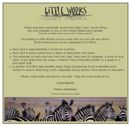
Lisa, world-saving webmaster of http://www.littleworksusa.com writes: littleworksusa.com


Is it possible to get my site evaluated? I will be doing some minor modifications on the code to ensure it is 100% valid next week.
Lisa, one thing my dad always told me is anything is possible. However, after belligerently insisting that he drink all the water in the world without swallowing an octopus, I was promptly grounded. So, on to your very evaluatively-possible site.

First, I respect your eleemosynary intents with your site. I hope that this site sends some business your way so that your charity can be helped. Second, thank you for providing me with the opportunity to pedantically and publicly display my knowledge of how to use the word eleemosynary. Moving on...

One of the first things I noticed with your site is that your homepage is pretty much a "gateway" page to the rest of your site. While you do have some content on this page, generally I wouldn't recommend going about it like this. Instead, try to put as much information (ie, content) relevant to your site as you can possibly fit within good design constraints and without making old people go blind. Also, on your homepage should be links to other areas of your site. This helps with search engine spidering, since your content (aside from your prominent privacy statement) is currently at least two clicks away, making it three levels deep. Spiders can be lazy sometimes, so you want to provide them the least path of resistance in getting to your content.

Your homepage design is clean, albeit not too exciting. You've got a pretty good color palette set up, in my opinion, and you can probably do a lot using the theme from your home page. I do like the rotating image at the bottom. But you have to do more with your homepage, because I can pretty much guarantee that you're losing visitors who don't see anywhere else to go but your privacy statement and some magical place called "Inside."

So what is this wondrous land of Inside? Well, it is a relatively unformatted playground for animated .gifs and over- and undersized columns. The first thing you see upon being granted entry to Inside is two pictures with purple boxes around them smack in the center of the page. There are two reasons I would get rid of the purple border:

  1. Purple (and that shade, specifically) is the default color for visited links, making me think for some reason that I have already seen the content to which these pictures link. It was not until closer inspection that I discovered that this purple border is actually part of the image, and not a link-visited-status indicator. If you want an example of what I'm talking about, look at your "subscribe" button image.
  2. Because it looks like the border around a picture from it being an image link, it looks very amateurish. In CSS, you can prevent this border from appearing around pictures like so: img { border: none; }, or you could simply put a border="0" attribute in your <img> tag.

In regard to your columns (and we're talking strictly the column sizes themselves), your left column is okay, since it is your navigation, but your middle and right columns are grossly mis-sized. Do you see how much real estate you waste in your middle column? You could be putting content in that space that people would read if they made it past your homepage. This space grows depending on the user's lust for screen size and resolution.

I know many people are proponents of liquid layouts, and there are times to use them, but when you don't have enough content to fill one out, you might want to think about fixing your widths, especially if you're not changing your content all that often. Your right column, while aiding the illusion of symmetry by being the same width as the left column, is choking your largest chunk of content. From left to right: keep, shrink and fix, expand.

Okay, what's next. Ah, yes. Design. Lisa Pisa, you gotta do something about it. African art (and just the theme of Africa) is so cool that making a design based on it should be pretty easy. Maybe you don't have a graphic editor like Photoshop, but like I've said before, there are plenty of freebies out there you could download and use.

Right now, I hate to say it, but your site is simply visually unappealing and confusing to navigate. In your left column, I don't know what are links and what is text without mousing over everything. It just seems like you threw this site together in a hurry to get these cards on the internet. Believe me, both you and your customers would be better served if you sat down and really worked on a cohesive, intelligent design.

Get rid of your animated .gifs. Lord, how I hate them. They pull your eye away from what you really want your visitors to see, which is your content.

Which brings me to the next item—content. You don't have any! Aside from your smushed right column and your "About the Cards" page, your site is virtually devoid of content. Where are the textual descriptions of each card, the history behind the site, or anything else you can talk about that people (and search engines) might be interested in? Write something!

I'll leave your code alone for now, since you are endeavoring to fix it, so my last bit will be on your "shopping" area. Unfortunately, your site is a prototype for why it is wrong to purchase third-party vendor shopping cart applications, and it's not all your fault. Usually, these apps are very inflexible when it comes to design, and they are more about "getting the job done," which seems to be the case with your cart. Sure, people can buy from your site, but will they?

When they click the "Go SHOPPING" link on your main site, they are nightmarishly ripped from their care-free playland of Inside and violently thrown into the Matrix construct program where you happen to be selling stuff. Ironically enough, (Warning: movie reference) people are just as disoriented and unwilling to accept the truth upon entering your shopping area. Although, Keanu would probably be more likely to understand if Laurence Fishburn would have told him that the truth was that he hadn't done enough to save the African children and that he should buy one of your cards.

Like I said, this isn't entirely your fault, but if I were you, I'd do a bit more research on my shopping cart vendor before I settled on one. Like I tell my clients, having a lot of solid content (in your case, products) is great and 100% necessary, but if you have a crappy design, no one will take you seriously as a professional and will most likely not purchase from you.

Now, in keeping with yesterday's popular theme, a summary in tanka:

Lands in Africa
And the sad, hungry children
Will benefit if
You redesign your website
And add a lot more content

Readers: purchase these postcards to aid this cause!

Wednesday, June 21, 2006

Political Websites and Poetry

This webmaster's review has come just in time for Independence Day...

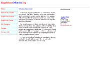
Anthony, creator of http://www.republicanoffensive.org, writes: therepublicanoffensive.org
I'm building this site for my brother. It's the first site that i've work on,and I don't know what to add to it to make it look more appealing.
Note to readers: Don't worry, I will not use this review as a soapbox for my political views. I promise to maintain objectivity and remain non-partisan. I mean, unbiased.

Anthony. Where to begin? How about with the good (as I usually do). Your coding is relatively neat and tentatively validates (meaning you're missing some metadata for the validator), although it appears you still have some inline styles and a few too many span tags. However, I don't know how many classes you really need with such little formatting. But we'll get to that in a second. Okay, more good. Hmm...your navigation is very clear and not confusing, always a plus.

Well, that's that. Bad stuff time.

Design: you have none. You want a way to improve your site? Normally I say start with content, but I personally dislike people who try to impose their political views (or any views, for that matter) on others regardless of whether I agree with them or not, so I'd say start with design. Right now it looks like a 12-year-old found Frontpage on his computer and decided to create a website between nap and snacktime. If you don't have Photoshop, there are plenty of cheap and/or free graphic editing programs out there. If you do have Photoshop, use it! Put some graphics in there. Make your site visually appealing! If you suck at design, well, see if you can get your brother to find someone to design for you. I'm sure he's got some connections.

Content: you have very little. You have essentially 10-15 paragraphs of content. The sites you're competing with for traffic have probably over 1000 times the amount of content you have. Literally. Assuming you get any traffic at all, do you think you're going to get any repeat visitors when you've only got two, maybe three "articles"? Maybe if you turned your whole site into your "my thoughts" section and used something like TypePad or Blogger, threw in even a modicum of design, and posted "your thoughts" every day, you would generate some traffic. Maybe.

Forums: get rid of them. Nothing looks worse than a site with empty forums. Maybe if you develop some sort of a following, you can put them back in, but I would wait until the site has been up for a while and people have been commenting. Assuming you give them some sort of interface with which to comment.

My summary, in five rhyming couplets:

While it seems like this is a short review,
I've actually given you a lot to do.

I understand this is your first site,
Which is why I'm helping you make it right.

Write more! Opine! Scathe! Vent!
Bash or support our president!

But if you want visitors to return,
Design and content should be your utmost concern.

Good luck and godspeed to you and your brother,
I hope I have helped you like I have the others.

Tuesday, June 20, 2006

More, More, More!

The finger is a bit better today, and I can type relatively pain-free. I will attempt to keep it away from the lethal combination of ground and size 12 cleats.
Tony writes: Saint Edward Catholic School
I am currently working on a site for the local private school. If possible, I would greatly appreciate some critique on the site. I am also having trouble trying to get it in Google. I used those things that submit your website to 200+ search engines, but all I got were a bunch of spam.

The site is available for viewing at http://www.stedschool.com
Tony, I've definitely got some helpful comments for you. But first, a few questions. Is this the official site for this school? If so, how robust do they want it to be? By the looks of it, it doesn't appear to be much more than a simple brochure. I can't imagine any other reason to visit this site other than to get directions to the school. I see there is a space for "Homework" where you will probably list assignments, but unless you have a sophisticated back-end, I don't see this being updated frequently enough for it to be useful.

Okay, onto the critique. We mentioned the homework page above, so let's start with that. "Under Construction" logo and/or text: always a no-no. Get rid of it immediately and replace it with some text explaining what the future use of the page will be. Optimally, the page will not be included at all until it is completed, but since it's already in your navigation, you might as well do something with it for the time being, "Under Construction" not being an option. It's amateurish and very annoying for users looking for something to read. Do you really want 1000 kids thinking their homework assignment is to dig a hole on in their front yard? Poor school secretary :)

Anyways, let's go to design. It's very simple, but not in the good way, unfortunately. It's far too simple to realistically be any school's official website. I understand you're in the process of building it, but there's no better time than before you really get into adding meat to the site to alter or enhance your design. Think about planning out what you want your site to include, like sections and subsections (also called "information architecture") and write this down. Then include some sort of clear sub-navigation for when users use the main navigation (not non-descript links at the bottom of the page). I know this paragraph started with design, but you can see how closely the two are intertwined.

More about design: do you really want your site to feature crayons? I understand it's a school for younger kids, but realize that those three crayons take up prime real estate on your page. Why not include pictures of some kids in the classroom, or a frontal shot of the school building (better than the one on your home page though. The lens flare is killing me). The horse logo is fine, as it represents your school.

Your page is confined to 600 pixels wide. This size is usually recommended for emails, but websites are recommended to be around 800 pixels wide. While there's not a lot going on in your site now, if there ever may be, you might find the 600 pixels to be a bit restrictive. Also, you've got to do something about the centered text. Use it in moderation, like for page titles and not much else. Something nitpicky I just noticed: your homepage main text area border is different than the border on every other page of your site.

Your code seems to be fine, as it validates, although it does appear that you have not completely separated your code from your design with CSS stylesheets. As for your content, though, it's a bit on the weak side. You really don't have much at all to say, and this could be a major reason why you're not getting traffic from search engines. In order for people to find you, you need to have something for them to search for. And yeah, submitting your site to "200 search engines" is always a bad idea. There are only three search engines that you need to worry about, Google, Yahoo!, and MSN, as they deliver over 90% of search engine traffic.

Summary: more design, more structure, more content.

Monday, June 19, 2006

Ow

finger Sorry, guys. I'm going to have to pass on a site review today, as I injured my left index finger yesterday playing Ultimate Frisbee, making typing extremely painful and slow. Yeah, lame, I know, but tomorrow I should be ok. Thanks for checking back.
Friday, June 16, 2006

Alcohol and HTML: Best Friends or Worst Enemies?

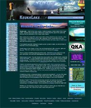
Bob, the creator of http://www.keukalake.com/, writes:Keuka Lake
I recently made my first attempt at creating a web site. I thought it would be a simple process….my first mistake. I built a site for “Keuka Lake” a popular tourist spot in western New York State. I uploaded it and submitted it to the search engines. Within three weeks it went from “nowhere to be found” ” to the 50 spot on Yahoo and 8 on MSN for any search that contained the words “Keuka Lake”. It was still nowhere to be found on Google. ... My overall question is “what am I doing wrong?” ... I have looked at the source code for other sites and I see several that contain this meta tag: <meta content="index, follow" name="robots"> Should I add it? I add to my site daily – should I create and upload a new site map each time I make changes? I have promoted this site regionally with newspaper ads and flyers, so I am getting traffic, I am just not being found via the search engines. Can it be fixed or should I give up the whole damn thing and just start drinking heavily? Any advice is greatly appreciated.

As I mentioned before, Bob, often the best solution to any problem is to begin drinking heavily. It's the only way you can focus on the minutiae of code. In fact, at my office, you're not even allowed to go in the building until you've chugged a handle of Jack. That's just how we roll around here.

After analyzing your site, though, I needed another. What. A. Mess. If I had a whole day, I wouldn't be able to list everything that needs fixing in your site. Fortunately (or unfortunately) for you, I don't have all day, and honestly, it's not all bad. The things you have going for you:

  1. Great content. You have a ton of content and it looks like it is all solid. This is actually the most important part of any website, so don't be too discouraged.
  2. Your metadata, including page titles and keywords are very good and descriptive. You're missing descriptions, though. Yahoo! is big on page descriptions, which may be why you're not listed there.
  3. You don't have any animated .gifs or blinking or scrolling text or random, worthless DHTML effects.

I know it's a short list, but hey, it's something. Now for the main things working against you (ready?):

  1. Design: godawful. If I were the head of tourism for Keuka Lake, I would have your head on a platter. It looks like it was made by a fifth grader in 1996. However, this may not be entirely your fault (from a design perspective), either, as I see you're using a Yahoo! page generator. I worked with one of those during my salad days and found it to be extremely inflexible as well. My first suggestion: learn HTML and stop using automatic page generators and WYSIWYG editors. Then, learn about design and implement a good one. And get rid of the tables surrounding your pictures.
  2. Navigation: overwhelming and unclear. I counted 26 navigation bars, and even one below the fold. How do you expect someone to find what they are looking for? Try creating five or six main categories and use them as a main navigation, then when people click on your categories, they're presented with a sub-navigation consisting of pages within that category. For instance, categories could be Food, Entertainment, Accommodations, Commercial, Photos, and Miscellaneous.
  3. Code: this is the worst part of your site. Your code is some of the messiest I've seen (try validating your code...143 errors). Again, I'm guessing this isn't entirely your fault because the page generator or WYSIWYG editor you're using is creating your code for you. I noticed you don't even have a CSS stylesheet. What do you do if you want to make a site-wide font color change (aside from begin drinking heavily)? Again, I understand this is probably handled by your generator/editor, but in case you decide to pull the plug on it and start manually editing your site, you should learn some CSS and try to implement it. Right now, without some sort of program, your site is virtually uneditable.
  4. Incoming links: you have none. My site is a start. Now go get some more. See if you can get those to whom you have linked to link back to you. Google's single largest factor in determining site importance is incoming links. This explains your 0 PageRank.

Unfortunately, I have to cut this short because I have other things to do today, but this should get you started. The good news is that your site is not un-salvageable. Learn HTML (or XHTML, if you can) and CSS and read up on site layout and you can clean this site up considerably. Oh, one thing I forgot: you mentioned you submitted your site to a bunch of search engines. Be careful when you do this, because you may be submitting yourself to a bunch of link farms and spammy neighborhoods, big no-no's for all the big search engines. If you're going to submit yourself to search engines, only do it to the GYM. And yes, you should include the "robots=follow" meta tag.

Be careful with that whiskey, and by that, I mean don't spill any when you're slugging it. Good luck. I'm curious to see the re-vamped version.

Thursday, June 15, 2006

Singing the Browns

I hope you guys liked the tutorial from yesterday. Today it's back to site reviews!singclub.org

Shawn writes:

I love the idea behind your blog, and I hope it gives back enough that you don't get burned out on it.
Thanks, and amen to that. So far so good, though.

I'm the webmaster for a small-niche organization: a traditional singing club in the greater Twin Cities area of Minnesota. My main aims with the website are to keep members posted on upcoming events (in conjunction with regular email updates), to provide useful resources for them, and to attract new members. Secondarily I'd be thrilled if the site became useful for people outside our area who share our interests. Naturally I want it to be as usable and attractive overall as I can manage. (Professional appearance is less important than a comfortable look and feel that will neither daunt technophobes nor annoy geeks such as myself.)

http://www.singclub.org/

What do I need to fix, and how can the site better serve its purposes?

Shawn, I'd have to say that in general, your site serves your purpose. It appears that the site provides a means for your users to stay informed (so long as it remains updated, which at the time of this writing, it is). You provide your users with some useful links and current information, which I believe is tantamount to useful information. Also, your site would validate with minor fixes (what appear to be simple coding oversights, like closing a tag one time too many), so no problem there. You use generally proper XHTML/CSS structure (I'd lose the [b] tags and replace them with [strong] tags). Overall, structurally, nice work.

However, there are a few areas you can improve upon. You mentioned that you want to attract new users. It's pretty hard to do that if they can't find your site. Google says you have zero incoming links. If you want to start showing up higher in Google search rankings, you must get people to link to you. You should try to get those sites you link to in your bios to link back to you. Also, your metadata is a bit weak. Your keywords are the same on every page, meaning that some of them don't match the content on your pages. Your titles, while I suppose aren't that bad, would possibly benefit if they were more descriptive. Try to work a keyword or two into your title, for instance, instead of "Traditional Singers Club - Upcoming Events" call it something like "Upcoming Irish or Scottish Singing Events." While a bit less user-friendly, it's not terrible. No one is going to search Google for "Upcoming Events" but they might be looking for "Irish singing events." I think you catch my drift.

Also, something I noticed is that you don't have any news articles or writeups of any events. I think that this may be something useful to your readers and would add a bit more meat to your site.

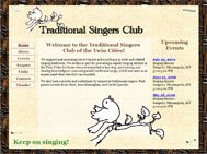
On to design, I think you've taken a creative approach, making your site look like it's posted on a telephone pole or something, just how a singing venue might be guerilla advertised. A few things to note (although some may seem a bit nitpicky):

  1. The repetition of the bird design element. I would get rid of it either at the top or the bottom, and my guess is at the bottom since it's out of context down there.
  2. Your staples are grainy. When you cut them out and save them for web in Photoshop, be sure to put a matte on them. This helps transparent images blend into their background better.
  3. You have some tables (used in correct semantic context) that are relatively unformatted, and thus look amateurish. I would put some sort of styling on them, like thinning out the borders and putting a color on them. It looks like you've got a decent handle on CSS, so this shouldn't be too tough.
  4. Your homepage looks like every other page in your site. Remember that your homepage is where most of your traffic comes through. Put some unique elements on it so that it looks different without straying too far from the original concept.
  5. Aside from your background, your site has about four colors. Keeping your main palette small is good, but you should expand your auxiliary palette, meaning using different shades of existing colors. For instance, I suggested you format your tables. Maybe you could use a light brown for your cell borders. Also, you can pretty much always use shades of gray.
  6. The big, green "Keep on singing!" at the bottom of every page looks like one of those things that you put there and you just like it. Fair enough, but personally I think it looks out of place. While I suggested you include more colors, you don't have green anywhere else on your site, and it looks like it's the largest text in your site. I think a more effective way to say this may be to keep it in the same position on your page, but make it the smallest text on your site and put it in a lighter brown that matches your background.
  7. Your navigation is confusing design-wise. Since you didn't expand your <a> tag in your CSS to include the whole rectangle, the "button" behaves oddly when you mouse over it. One way to remedy this in CSS is display: block; width: Xpx; height: Xpx; on your <a> element.

Okay, I think that's all I've got for now. Summary: good information, pretty good coding, some fixes to the design and metadata, get some incoming links. I'm sure your users would love to know what's going on, so some articles may be in store. Other than that, keep on singing!

Wednesday, June 14, 2006

Tutorial: Semantic Liquid Rounded Corners

I've decided that in addition to site reviews, I will provide tutorials on certain subjects as I see fit, considering tutorials are a great way to help a broad audience of people. Welcome to my first tutorial :)

In a discussion forum the other day, people were talking about how to create something called "liquid rounded corners," which basically means a box that looks like it has rounded corners but adjusts "liquidly" or freely with the size of both the content and the browser window size. Apparently, people were having problems with how to do this semantically using XHTML/CSS. There was discussion of using floats, positioning images, and much arguing and revelry. So, someone asked me to provide him with my version of the best solution that works in IE, FireFox, and Opera, and here it is.

My take on how to do this is to rather than create empty, pointless divs whose only current and future purpose is to provide a rounded corner is to create several wrapping divs. Name them something useful so that if you decide to change your design later, you don't have to worry about fixing all your divs from "upper-left-corner" to something like "blue-box-background" or whatever your change may be. In this example, I have four divs: wrap, inner-wrap, content-wrap, and content. The HTML looks like this (greeking added to fill out the box):

<div class="wrap">
<div class="inner-wrap">
<div class="content-wrap">
<div class="content">
<p>Lorem ipsum dolor sit amet, consectetuer adipiscing elit. Suspendisse non odio. </p>
<p>Maecenas odio velit, posuere non, sagittis at, pharetra id, lorem. In euismod diam in elit tincidunt rutrum. Curabitur pharetra pede a risus. Praesent tempor nisl vitae nunc.</p>
</div>
</div>
</div>
</div>

As you can see, there is nothing special about the HTML, just a few nested divs. I wish I could indent the code for you, but it's a pain with Blogger. Moving on, the CSS is also very easy and straightforward. The images are images I have hosted here on this site, which you're more than welcome to use if you'd like. The CSS:

.wrap {
background: #D92326 url(http://photos1.blogger.com/blogger/ 5184/3100/320/ul.gif) no-repeat top left;
}

.inner-wrap {
background: transparent url(http://photos1.blogger.com/blogger/ 5184/3100/320/ur.gif) no-repeat top right;
}

.content-wrap {
background: transparent url(http://photos1.blogger.com/blogger/ 5184/3100/320/ll.gif) no-repeat bottom left;
}

.content {
background: transparent url(http://photos1.blogger.com/blogger/ 5184/3100/320/lr.gif) no-repeat bottom right;
padding: 10px;
}

Again, being able to indent would help a bit, but you get the idea. Notice how the only padding is in the inner-most div, "content". If you put padding (or margins) in any of the other divs, it will throw off the alignment of the corners. Also notice that instead of using pixels or percentages (which I could also have done), I used the terms "top left" or "bottom right" to position the background images. I do this because it helps me differentiate when I'm going back through the classes which one is which.

If you'd like, you can check this in IE, Firefox, and Opera and you'll see that it works the way it should in all of them. Listed below are the images I used. They aren't transparent on the outside, but all that takes is some photoshopping. If you're looking to add extra features, let me know and I will append them to this tutorial. I hope this helps!

Images:

  • upper left
  • upper right
  • lower left
  • lower right

Tuesday, June 13, 2006

Is Design Absolutely Necessary?

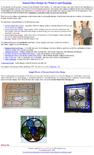
George, of www.glassdesignsbygeorgemcginn.com, writes:
Hi Jason,
I've been following the Sitemaps Google Group for a few weeks and saw you post today. I'm always looking for constructive comment so here is my website related to being a stained glass and woodworking artist. Sites been up for over 4 years now.
How to approach the review of your site has made me do a bit of thinking. Clearly, the purpose of your site is not to wow visitors into buying your handiwork, which by the way, is fantastic from the pictures on your site. You are not a designer and/or programmer, but you know enough to get your message onto the web without falling into the trap of placing every animated .gif and DHTML snippet you come across. Will people still be compelled to listen to your message and view/purchase your product due to your apparent genuineness (yep, it's a word) and skill in your craft, or be repelled by the site's lack of any sort of formatting and design?

Honestly, I don't know, but I'm leaning towards yes, they may still be compelled. Personally, if I were looking for a piece of hand-made art, I would trust a guy who looks like he's running the show himself and hasn't hired some fancy-pants designer and coder to build him some wonderfully dynamic and automated site that once they cash their checks they want to have nothing to do with it and leave him to mess up the site himself due to lack of design and/or code knowledge. In short, if I came across this site and was looking for this product, I would be inclined to purchase. On the other hand, some people may interpret the lack of professionalism of the website as a lack of professionalism in the company and be deterred. I know that I am occasionally guilty of discrediting a business simply because their site is ugly and/or poorly structured or coded. But then again, I'm a website snob.

Basically, the site may be so bad design-wise that it is good. Your site is laden with content, which is, of course, the most important part of any site, so people and search engines have something to chew on. Your code, while antiquated (HTML 3.2, holy crap), tentatively validates. I've never seen a site tentatively validate before, but heck, W3C doesn't seem to mind, so I guess neither should I, aside from the fact that I would suggest you upgrade to XHTML 1.0 Transitional (at least) to prevent your site from becoming completely obsolete in the future. Your page titles and metadata are all solid and relevant. I would create some sort of persistant and obvious navigation so the user does not have to constantly go back to the home page to reach other areas of the site, but structurally overall, this site is sound.

I could tell you that the site sucks because you have no design and people would agree with me, but that's not necessarily true (and they're superficial bastards). While I think that a bit of design would help, with what I can infer about your level of graphical design and HTML skill, I think you may end up making the site worse, unless you have it done professionally. There's nothing worse on the web than someone who thinks they know what they are doing and tries to act upon their untrained notions. Part of the beauty of your site is that you've accepted the fact that you're not a web designer, but rather an artist skilled in other arts.

If you're looking to increase business, hire someone to overhaul your site with a shopping cart and try to get people to link to you (according to Google, I may become your only incoming link). If business is good, you can't really afford to hire anyone, and an influx of business would be too much, aside from the minor tweaks mentioned above, I wouldn't change anything.

Monday, June 12, 2006

The One Page Wonder

I'm back from out of town and ready to crank out another site review. Who's next?

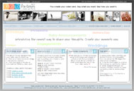
Doris, whose site is www.321forkeeps.com, is writes:
I really need help generating traffic to my company’s website. People tell me they think my site is cool .. but what in your opinion can I do to generate an itube.com following?

I don't know what you mean by an "itube.com" following. I visited it and it's some government healthcare site. What kind of following can a government healthcare site have? Anyways, I will infer that you simply mean a following of sorts.

Moving on, your home page design is not bad. Albeit confusing, the drag and drop feature at the top is neat (what am I dragging and dropping for?). The information on there is clearly delineated and the page looks clean and professional. However, there are many things wrong with your site that may be keeping the search engines out.

  1. You have hidden text. This is the number one worst thing you can do.
  2. You only have one, maybe two, legitimate pages that someone can visit without having to create an account and/or sign in (your home page and your FAQ page [which pops up in a new window. Bad, bad, bad]). How can you expect someone to find you using a search engine when you have absolutely zero public depth to your site? Search spiders can't create accounts.
  3. Because there's very little content on your homepage for a search engine to deem valuable, no one will ever be able to find you. The first sign of any sort of (non-hidden) content is buried about 300 or so lines into your (extremely messy) code. Any bot will start trying to work its way through your page and eventually get frustrated and leave because it has to sift through so much structural garbage (see: tables) before it can even get a scrap of meat.
  4. As mentioned above, your code is heinous. As a developer, if someone gave me this site and said, could you please change this to this and make this this color, I would probably recommend an orifice to where they could shove their website. While you do make use of CSS (a bit), you do it in such a way that it is more confusing than just using inline styling (of which you also use a bit). You have six style sheets, and about a million classes (and only one page!). If you wanted to fix something, you would have to sift through every class on six style sheets to find it. Not my idea of fun.
  5. With javascript turned off, your site completely ceases to function. This is bad, because search bots can't do things like visit other pages (if you had any). It's also very bad from an accessibility standpoint. The best practice is that if your site should have some sort of javascript functionality, it should still be very navigable even if the javascript is turned off.
  6. One last thing (there are many more, but I don't have time at the moment to go on). The title to your homepage is "321forkeeps.com - [home]". Some SEO experts will tell you that your page title is the most important part of your page. For the most part you are right. Unless someone is looking specifically for the phrase "321forkeeps," they're not going to find you, and if they are, they clearly know how already.

As for your site in general, I think the concept is really cool. For certain things, I can see how it's better than some pre-made e-card (certain things being life events). Your example card is good, since it displays the power of your application well, although I might suggest scrapping the 80's club techno music. I would say that, depending on your budget and timetables, you're a few months to many months away from turning this into something that will generate traffic. As for now, keep passing out business cards.

Friday, June 09, 2006

I'm Out

I'll be on vacation this weekend (starting today, my plane leaves at 9am), so new posts will resume on Monday.

Wednesday, June 07, 2006

The Passion of the Webmaster

Colin writes:
My website - http://www.wrwz.com is an information/content site about World Music and Culture. I write the content because I love it and do the design because I have to.

Naturally, I am looking for tips and feedback for gaining more traffic.
First of all, congrats on writing about something you love. I build websites and help people for free because I love it, too. Passion is something often lacking from professionally built websites because the professionals don't understand your passion; they're in it to get paid and add another notch to their belts. On the other hand, professionals are professionals for a reason: they do good work, people like it, and they continue to get hired. Unfortunately, you can't build a website on passion alone, so you either have a fusion (a professional doing his own site) or a disparity. Very rarely will you get that fusion from a professional doing a paid job, and if you do, you should hold on to him or her.

That said, let's get to your site. First off, your design, while clean, is unattractive and amateurish. If you are a real-deal magazine, no one is going to believe that this is your site. I don't know how "big-time" you guys are, but if you want an example of something to aspire to, check out Sports Illustrated's website. I'm assuming you don't have the kind of money they do, but understand my point: you can create your own credibility on the internet. If someone had never heard of SI and wandered onto their site, immediately they would recognize this site as a definitive source for sports on sheer design alone. Now if SI was indeed a fraud (which, of course, it's not), the user would quickly find out by the quality of the content. You have excellent content, from what I've read – interesting articles and even some instrument-playing "how-to's." If you complement that with a kickass design, you'll see your traffic level begin to rise. On a side note, if you're actually a print magazine, when you've finished your site redesign, make a big stink of it in your print. People will go, I promise.

Now to the more specific items:

  1. Your Google ads. They are glaring and obtrusive. There have been studies done that show that people are more likely to click on a Google ad if it is inconspicuous and appears to be just another link on your site (see my example at the top of this page *wink*). However, even if this wasn't the case, the ads look ridiculously out of place, since they don't even fit into the rest of your site's color scheme. Move them, change them, or get rid of them.
  2. Your pictures and graphics. They appear squished and grainy, and upon checking their properties, completely unoptimized. If you were to abide by my suggestions and actually get more traffic, your bandwidth would be out of control relatively quickly because your pictures are so large. For the sizes of the pictures on your site, none should be larger in file size than maybe 15-20KB max. If you don't have Photoshop, I would suggest making the investment. It's a bit much up front, but once you get the hang of it, you will realize it is worth it's weight in gold, salt, platinum, moon rock, and babies combined, especially if you want to remain in the internet world. As for your pictures being squished, if you're going to set the image height and width attributes, make sure they match those of the original size.
  3. Learn CSS and get a stylesheet. If my suggestion of you redesigning your site made your stomach do the watoosie, then learning CSS is your personal Pepto Bismol. You will find site creation and updates much easier if you have a stylesheet. For more on the power of CSS, check out CSS Zen Garden. Be sure to read everything on that site, as it is a great example of why you should use CSS.
  4. As with most sites I will review here, make sure your site validates. Right now your homepage lists 107 errors. If you want to see them, click the link in the column to the right that says "validate your code" and enter your URL. By ensuring your site validates, you are ensuring that your site is accessible to anyone using any browser on any platform as well as creating code that is easier to update should you have to.
  5. Your homepage is too long. This may be because of your inefficient use of space. Check out SI.com again and see how they don't waste a lot of space and yet somehow manage to keep the site from looking cluttered. They cover more material than you in less space. I understand you're a magazine and you have a lot to cover, but being a magazine, I would imagine you would understand the importance of page real estate.

That should get you started, Colin. You've got some good information on your site. If you read this article and couple it with yesterday's article, you should get a lot of help, since you guys are in a somewhat similar boat. I'd love to see what you can do with this, because it's got some great potential.

Tuesday, June 06, 2006

Concept vs. Reality

Dennis writes:
Hi Edelman, your site is a great concept.

Aww, shucks. Thanks :)

I have moved from the uk to turkey, and have opened up a real estate office in a small village called Akbuk. My website is www.turkeypropertyzone.com/ could you have a look and make some suggestions? ... I could do with a complete overhaul and pointing in the right direction with how to best promote my site, eg should I try and increase my pagerank, submit to directories, use an automated links program, or does this not matter at all? Should I be looking into building more fresh pages? But these would really only be entry pages for the search engines anyway! Just really needing some guidance from the ones in the know.
Well, Dennis, there are some good things and some bad things with your site.

GOOD

Throughout your site, you have a ton of content, and it is all quality content. This is by far the most important facet of a website, and one that many, many sites fail to do well. So long as you keep your writing good, plentiful, and fresh, your site should fare well, at least when it comes to search engines (see BAD below for how content can be a double-edged sword).

Another GOOD I observed is usability. Again, this is a very good GOOD. Basically, this means that when a user clicks on one of your property links, they are presented with a page full of the necessary information in a tight, concise, bulleted format. Your links along the side of each property are very helpful and not overbearing. Also, the pictures and floorplans included in most (or all, I didn't really look at all your properties) are presented in an easy-to-access format with descriptions below each one. This is good. A lot of sites will provide the user with a smorgasbord of thumbnails and no guide as to what they are.

Your navigation is relatively intuitive, so the user is not presented with any surprises when they click to go to a new section. Your side links are, for the most part, relevant and descriptive. You even have a somewhat-comprehensive site map. So all in all, good work, Dennis, on the conceptual "beef" of the site.

Which leads us to...

BAD

From the glowing review above, you would probably assume the link above will take you to some amazing site where flowers shoot out of your speakers and gold pieces pop out of your USB ports. Not so much. While conceptually very strong, this site is very weak aesthetically. First of all, if I were a company selling properties, houses, and bare land, I would probably not have my logo look like the symbol for radioactivity. The site overall lacks any sense of design or formatting, which, despite the great content, can really drive a user away by decreasing your legitimacy as a company. People buy from professional looking sites, not sites that look like Two-Toof Timmy took a picture of a boat and uploaded it to his favorite WYSIWYG tool, took a step back and said, "Hay Marfa, ain't this lookin' purty nah?" and then did nothing else to it. Not saying that yours is that bad; I was just making a generalization. At least you didn't go the way of blinking animated .gifs. Something a bit more nitpicky than anything: your main navigation is very tiny and not obvious. Beefing that up and maybe styling a bit would help.

Your code, as you may or may not have guessed, does not validate, since it doesn't have the required DOCTYPE at the top (amongst other things), and although you do have a stylesheet, there's one class and a few tag definitions. At this point, I believe you have enough content that you can really start working on your styling. I see that you've created your site in Dreamweaver. While I am very much against using Dreamweaver templating for professional sites, it does have some merits that make it useful for smaller-budgeted sites that still have a lot of static pages. I believe that it could help your site a lot, especially if you're looking to use some of the same page formats and some CSS. If you aren't exactly sure how to use DW templates, there are plenty of tutorials out there.

One last thing bad about your site that can be fixed immediately is the length of your homepage. While it's not uncommon to have longer internal pages (although try to keep your page length to a minimum), your homepage is your main selling page. If it's not attractive or too long and overbearing, nobody is going to venture further. Try to keep as much as you can "above the fold", or above the point where the page begins to scroll.

As for your questions about traffic/links, do NOT, under ANY circumstance, submit your site to a link program/farm. You will be banned from Google. Submitting to directories is good, like DMOZ or Yahoo! directories, especially if you get in. And if you have time after restyling/redesigning your site, yes, you should always try to create fresh content. Google really likes fresh content.

So, to wrap this whole thing up, you're off to a good start because you have a solid foundation, which is your content and information architecture. Your next step is to sit down for a few hours and really bang out a great design, or hire someone to do it for you (just don't buy one of those terrible cookie cutter sites) and then code it out. Remember that your website isn't just a brochure telling people about your company and properties, but rather a selling tool you use to acquire business. Keep that in mind and you can do some great things with this site.

Monday, June 05, 2006

Focus On Usability

After being heckled a bit on a Google Groups thread for providing a free service (Heckled for providing a free service?, you say. Believe me, I don't get it either) and being called a spammer, a poster challenged me to review his site, www.sellyourhouseforfree.com. I accepted his challenge.

Charles writes:

Can you review this site [link is above] for me please? ... Focus on usability.

Ok, so I reviewed your site, focusing on usability. Here's what I got:

Overall, the usability is pretty good. Adding houses is easy, and searching is easy. A few things I noticed, though, are

  1. You've only got 500 some listings (at the time of this writing). While this isn't a programming/usability flaw, per se, it does render the "search by zipcode" box pretty useless, as there are thousands of zipcodes in the US, and it appears you're doing other countries as well. My suggestion would be a country dropdown, and if they pick US, dynamically display a state dropdown, and upon state selection, enter a zipcode. Also, allow the user to search at each level using those parameters (ie, all in US, all in Florida, etc). If you provide this COUPLED with the current zipcode box, it should increase your usability. Also, what is a place-name? As a user, I have no idea what this means.
  2. While it is very easy to create a user name and password, it may be too easy. If someone really wanted to mess up your database with fake usernames, it would not be very hard at all. Many sites require a bit of information before the user name can be registered, thus deterring attacks that you may be vulnerable to.
  3. In the search results grid (where, by the way, "countRy" is spelled "county" in your third column), the lack of the ability to sort by columns limits the usability. By ordering the properties by ascending prices, you assume that the only thing the user is searching for is properties by price, when in fact the user should be able to sort by all columns.

Other than that, the simple design lends itself to simple, straightforward, not confusing use. With some minor tweaks, this site could be very good, and has the potential to take off (provided you get more properties, some paid advertisers, and a bit of exposure). It reminds me a bit of a better looking Craig's List.

Saturday, June 03, 2006

Subject Is Death Of Site

Robin, whose site is www.graveimagery.com writes:
I'm a photographer not really a designer. I'm so lost when it comes to google. I've been trying to figure out their site map thing and I'm LOST. I'll take any help you want to offer.......I get no traffic at the moment.....

I took a thorough look at your site, Robin, and I've got to say that you have a very fitting "look and feel" to your site that is relevant to the subject matter, despite the amateurish design. Many sites fail to acheive this, even with professional design. You've also got a nifty little picture selector that doesn't rely solely on javascript (a very good thing), which is where you do your business. You don't have any moving text or animations, or anything else annoying that would turn a visitor away. So, as for you getting no traffic, well, I had to dig a little deeper (pun very intended) to try to figure it out. Although you've only got your homepage indexed in Google, Yahoo! and MSN both have your site relatively well-indexed. I looked at your code, and you've made the typical dilettante mistakes, such as using FrontPage and not including a doctype (see previous post) and adhering to it, with much invalid code, among others (<font> tags, mainly).

But this doesn't explain the lack of traffic. Honestly, the only thing I could think of was that it could be your subject matter. I know you're a niche operation, but maybe you're the only one in this niche. I, for one, have no need for a random grave shot. I can understand if you maybe did photo shoots for people or catered to a goth audience who is more into that stuff (which you may be doing), but in all honesty, I think the problem may be your content.

However, that's the worst thing, and there's a double-pronged solution: patience and advertising. Okay, a bit of copy rewrite with some SEO work wouldn't hurt (see previous posts for help with this), but mainly you need to get yourself out there. There's always SOMEONE out there who is looking for what you're offering. Once you get yourself out there, be patient. You can't force your domain name into people's browsers.

As for Google Sitemaps, I have had bad experiences with them. I had a site with a valid sitemap and it did nothing but hurt my site index within Google. When my page count finally dwindled to zero, I removed the sitemap, and within 24 hours, I was back to top-level index pages. If you still want to know more about how to make a Google Sitemap, comment here and I will make a "Making a Google Sitemap For Dummies" post later.

Sorry I couldn't be of more help. Traffic generation is very difficult to acheive sometimes, even with a top-of-the-line site, especially if you have obscure subject matter. Just keep working on your content, keeping it tightly focused. Also, try to think of different words that people who may be looking for your content might type in, such as "grave pictures" or "tomb photos." Try using the "Keyword Suggestor" tool on the right. Then once you have the words and phrases you like, weave them into your content. Create unique titles and metadata (keywords, descriptions) for each page using these keywords. After you do this major overhaul, wait about a month for results. You should be surprised.

Friday, June 02, 2006

Make Your Site Work (In More Ways Than One)

Jami, whose site is www.abnsave.com, writes:
I really need help generating traffic to my company’s website, but I just started this website development thing and haven’t got a clue. I’m also trying to figure out how google adwords works, so any advice you have would be most excellent.
By the looks of it, Jami, you're off to a pretty good start. While the design lacks any sort of creativity or ingenuity, it makes up for it with cleanliness and simplicity, two things many sites lack. For someone who claims to not have a clue, you're doing okay on the coding end as well. There are a few recommendations I would make, though, aside from learning CSS/XHTML div layout structuring concepts (ie, using divs instead of tables to lay out your site).

My first suggestion would be to get rid of all the styles at the top of each page and aggregate them in a CSS stylesheet. I see you've got one already, but for some reason you're still using page-specific styles. The problem with this, of course, is that if you have a class that you use on one page that you want to use on another, you have to recreate this class on that page. Then, if you want to modify that class, you have to touch each page. If you keep all your styles in one stylesheet, all you have to do is touch the stylesheet and your changes are made throughout the site.

Second, put a doctype on your document. I would suggest XHTML 1.0 Transitional or Strict. If you do this, though, know that you must adhere to these standards if you wish for your code to be valid. Why should you care that your code is valid? Well, it depends on your audience. If you want to get as wide a range of customers as possible, you should make sure your code is valid, because this is the best way to ensure compatibility across browsers and platforms. If you are creating a site for a specific, known group of people using a specific browser, validation is not as important (although I will always highly recommend you write valid code). Valid code also leads to fewer headaches when things go wrong, as valid code is much easier to debug.

Okay, onto your questions about generating traffic. One way that is effective is finding a forum out there that discusses your line of business and start talking in it, putting your site at the bottom of your posts. People will follow the link. Another way is to SEO your site, which is a bit more complex. Search engine bots likely crawl most of your pages every day, and you're in the GYM, so getting indexed isn't your problem (everyone should be so lucky!). Basically, what I would suggest is going back through your site and, like I told Al, try to figure out the focus of every page and really try to tighten up your copy so that it reflects one singular idea. That way, when someone types that idea into a search engine, your page will be relevant. Sure, there are other little tips and tricks, but the best way to get to the top of search engines is to have quality, focused content.

In your quest to generate traffic, do NOT submit your site to link farms and other shady sites. This will get you banned, and no one goes to those sites anyways. Instead, try to exchange links with someone else with a similar site, or preferably just get them to link to you. You generate traffic through links.

As for AdWords (I assume you mean what you say, and not putting advertising on your site, aka AdSense), go for it. It's pretty easy, and it will generate a modest amount of traffic. Just pick your words carefully. Advertising is pretty much the only way anyone will ever hear of your site, be it paid or unpaid, so you might as well do what you can.

Anyways, hope this helped. Let me know by posting a comment here.

An Example of What Not to Do

Al writes:

I definitely could use some advice. The site is lastminuteusvacations.com. Please let me know what it needs.


Well, Al, there are many, many things wrong with this site. For one, the site is extremely plain and unprofessional looking. I don't know of many people looking for a vacation in the tropics who would consider purchasing from a site that looks like this when they can just as easily go to Orbitz or Expedia and know they're getting something from a trusted source. While you may have better prices (I don't know this, but let's assume you do), people are more willing to pay an extra few dollars for something like an expensive vacation from a site that looks like the people know what they're doing.

If this is your company and business, I would seriously consider hiring a professional to create a good design for you and code it out. If you're not looking to hire a professional, here are some other suggestions:

  1. Stop using FrontPage and learn HTML (or better yet, learn XHTML). FrontPage is one of the worst products invented since the advent of the internet. HTML isn't that tough. You can find literally millions of HTML tutorials on the internet.
  2. Come up with a logo for your company. It looks like your "logo" doesn't even represent your company name. Once you have a logo, create your site using that as a base for your color palette.
  3. Use fewer ads. For the love of God, use fewer ads. No one likes being attacked by endless Google ads. I know you can "make money" using AdSense, but putting 3 or 4 sets of ads on a page is a bit of overkill and will discourage people from clicking rather than entice them.
  4. For your giant table of vacations, pare it down. Cut it into manageable chunks that a user might actually look at and have teaser links leading deeper into the site.
  5. When linking within your own site, do NOT have the new page pop up in a new window. This is very annoying.
  6. Come up with sections for your site. Right now your information architecture is all over the map, without any sort of logical flow to your site. Also, make an About Us section where you can put information about your company, a Contact Us section, and a news section. Really take some time to plan out how your site should look. Ever seen a family tree? That's kind of how your site should look (minus all the marriages and divorces). Put the home page on top, and then put your main sections underneath it, and the main sections' subsections beneath them. Once you do this, you'll see how easy it is to create a good site with coherent navigation. If you want an example of good information architecture, check out www.columbussupply.com (yes, it's a shameless plug, but it's also a good example) and go deep into the site. Watch the sub-navigation on the left and the breadcrumbs at the top. They clearly delineate your path and your options for a given section.
  7. Write good copy. Right now your copy is generic. While your site may be legit, there are a bazillion spam sites out there with copy very similar to yours. Really focus in on what you think people are looking for when they come to your site and then write tight, concise copy using what you came up with as a base. Then, make sure that this copy (no more than a short paragraph or so) ends up underneath your heading.
  8. Make sure your homepage isn't much longer than the height of the screen. This is more of a personal design preference, but useful. Many people when they come to your site look only at your homepage. A lot of times they won't even scroll. So, if you have content "below the fold" (ie, where the bottom of the screen is), there's a good chance it won't get read.

Okay, there's a few things to get you started. Good luck :)